# 4.3 单选框(Radio)
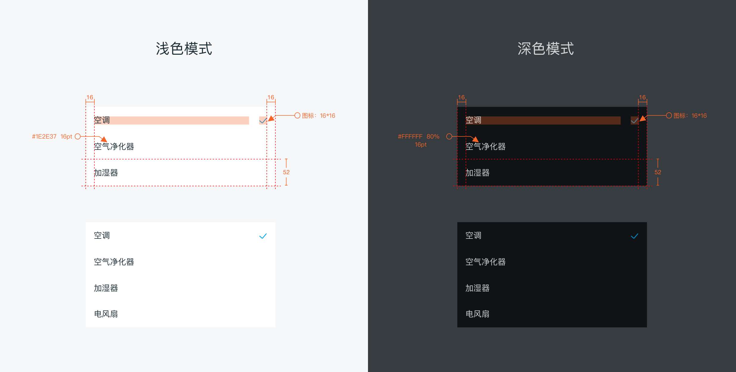
用于在多个备选项中选中单个状态。
# 单选框样式
# dof-radio单选
单选组件,建议以成组的方式出现,使用dof-radio-list
# 实例
# 基础用法
<template>
  <div class="wrapper">
    <dof-minibar title="Radio" background-color="#00A4F2" text-color="#ffffff" :left-button="leftButton"></dof-minibar>
    <scroller class="scroller">
      <dof-catalog title="使用案例" background-color="#daf9ca" :has-margin="true"></dof-catalog>
      <div class="container">
        <text class="subTitle">当前选中:{{ checkedInfo.title }}</text>
        <dof-radio-list :list="list" @dofRadioItemChecked="itemChecked"> </dof-radio-list>
        <!-- <text class="subTitle">时间选择器 repeatType:{{repeatType}} selectedDay:{{JSON.stringify(selectedDay)}}</text>
        <div>
          <dof-date-cycle-picker
              :repeat-type="repeatType"
              :selected-days="selectedDays"
              @onRepeatSelect="repeatSelect"
              @onDayChange="onDayChange">
          </dof-date-cycle-picker>
        </div> -->
      </div>
    </scroller>
  </div>
</template>

<style scoped>
.wrapper {
  background-color: #fff;
}
.scroller {
  flex: 1;
}
.container {
  padding-bottom: 120px;
}
.subTitle {
  font-size: 28px;
  line-height: 60px;
  margin-left: 32px;
}
</style>

<script>
import { DofRadioList, DofMinibar, DofCatalog } from 'dolphin-weex-ui'
export default {
  components: { DofRadioList, DofMinibar, DofCatalog },
  data: () => ({
    leftButton: 'http://dolphin-weex-dev.msmartlife.cn/cdn/images/header/icon_back_white@3x.png',
    list: [
      { title: '空调', value: 1 },
      { title: '空气净化器', value: 2, checked: true },
      { title: '加湿器', value: 3 },
      { title: '电风扇', value: 4 }
    ],
    checkedInfo: { title: '空气净化器', value: 2, radioBox: [] }

    // 时间选择器
    // repeatType: '4',
    // selectedDays: '0111001',
    // selectedDay: []
  }),
  methods: {
    itemChecked(e) {
      this.checkedInfo = e
    },

    // repeatSelect(event) {
    //   this.repeatType = event.value
    // },
    // onDayChange(event) {
    //   this.selectedDay = event.value
    // },
    back() {},
    minibarRightButtonClick() {
      const home = 'index.js'
      this.$MID.platform.name.toLowerCase() !== 'web' && this.$MID.route.push(home)
    }
  }
}
</script>
1
2
3
4
5
6
7
8
9
10
11
12
13
14
15
16
17
18
19
20
21
22
23
24
25
26
27
28
29
30
31
32
33
34
35
36
37
38
39
40
41
42
43
44
45
46
47
48
49
50
51
52
53
54
55
56
57
58
59
60
61
62
63
64
65
66
67
68
69
70
71
72
73
74
75
76
77
78
79
2
3
4
5
6
7
8
9
10
11
12
13
14
15
16
17
18
19
20
21
22
23
24
25
26
27
28
29
30
31
32
33
34
35
36
37
38
39
40
41
42
43
44
45
46
47
48
49
50
51
52
53
54
55
56
57
58
59
60
61
62
63
64
65
66
67
68
69
70
71
72
73
74
75
76
77
78
79
# Attributes
| Prop | Type | Required | Default | Description |
|---|---|---|---|---|
| list | Array | Y | - | Radio-list单选组 见注1 |
| title | String | Y | - | Radio 显示 label |
| value | [String、Number] | Y | - | Radio 的 value |
| checked | Boolean | N | false | Radio 是否选中 |
| disabled | Boolean | N | false | Radio 是否禁用 |
注1: list
const list=[
        { title: '选项1', value: 1 },
        { title: '选项2', value: 2, checked: true},
        { title: '未选不可修改', value: 5, disabled: true },
        { title: '选项3', value: 3},
        { title: '选项4', value: 4}
      ];
1
2
3
4
5
6
7
2
3
4
5
6
7
# Events
| 事件名 | 说明 | 回调参数 |
|---|---|---|
dofRadioItemChecked | 选择时触发 | e e.value e.title e.oldIndex e.index |