# 8.5 指向性气泡(popover)
指向性气泡用于针对页面具体位置的内容进行说明/提示。
# 需求场景
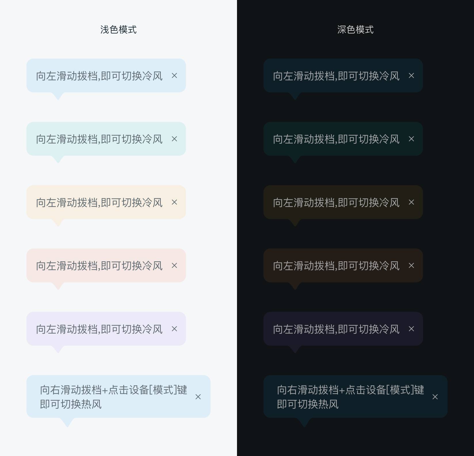
指向性气泡
# 实例
# 基础用法
<template>
  <div class="wrapper">
    <dof-minibar title="指向性气泡"></dof-minibar>
    <scroller class="scroller">
      <dof-button
        ref="btn"
        class="m-b-60"
        text="top"
        size="small"
        @dofButtonClicked="$refs['popover'].dofPopoverShow()"
      ></dof-button>
      <dof-button
        ref="btn2"
        class="m-b-60"
        text="bottom"
        size="small"
        @dofButtonClicked="$refs['popover2'].dofPopoverShow()"
      ></dof-button>
      <dof-button
        ref="btn3"
        class="m-b-60"
        text="left"
        size="small"
        @dofButtonClicked="$refs['popover3'].dofPopoverShow()"
      ></dof-button>
      <dof-button
        ref="btn4"
        class="m-b-60"
        text="right"
        size="small"
        @dofButtonClicked="$refs['popover4'].dofPopoverShow()"
      ></dof-button>
    </scroller>
    <dof-popover2
      ref="popover"
      :elPos="elPos1"
      :arrowPosition="{ x: 60, pos: 'top' }"
      :textStyle="{ marginRight: '10px' }"
      :textContent="textContent1"
      :coverColor="'rgba(0, 0, 0, 0)'"
      :innerBgColor="_isDiablo ? '#0e1f28' : '#E3EBF9'"
      :isShowClose="true"
      @clickedCloseBtn="$refs['popover'].hideAction()"
    ></dof-popover2>
    <dof-popover2
      ref="popover2"
      :elPos="elPos2"
      :arrowPosition="{ x: 60, pos: 'bottom' }"
      :textContent="textContent1"
      :coverColor="'rgba(0, 0, 0, 0)'"
      :innerBgColor="_isDiablo ? '#0d2122' : '#E6f3F8'"
      :isShowClose="true"
      @clickedCloseBtn="$refs['popover2'].hideAction()"
    ></dof-popover2>
    <dof-popover2
      ref="popover3"
      :elPos="elPos3"
      :arrowPosition="{ y: 35, pos: 'left' }"
      :textContent="textContent1"
      :coverColor="'rgba(0, 0, 0, 0)'"
      :innerBgColor="_isDiablo ? '#0d2122' : '#E3F3F1'"
      :isShowClose="true"
      :width="240"
      @clickedCloseBtn="$refs['popover3'].hideAction()"
    ></dof-popover2>
    <dof-popover2
      ref="popover4"
      :elPos="elPos4"
      :arrowPosition="{ y: 35, pos: 'right' }"
      :textContent="textContent1"
      :coverColor="'rgba(0, 0, 0, 0)'"
      :innerBgColor="_isDiablo ? '#E09916' : '#F8F0E4'"
      :textStyle="{ color: _isDiablo ? '#cfcfd0' : '#232323' }"
      :isShowClose="true"
      :width="240"
      @clickedCloseBtn="$refs['popover4'].hideAction()"
    ></dof-popover2>
  </div>
</template>

<style scoped>
.wrapper {
  background-color: #FFFFFF;
}
.scroller {
  padding: 102px;
  display: flex;
  flex-direction: column;
  align-items: center;
}
.m-b-60 {
  margin-bottom: 60px;
}
@media screen and (weex-theme: diablo) {
  .wrapper {
    background-color: #101315;
  }
}
</style>

<script>
import { DofMinibar, DofButton, DofPopover2 } from 'dolphin-weex-ui'
import DiabloMixin from 'dolphin-weex-ui/mixins/diablo'

export default {
  mixins: [DiabloMixin],
  components: { DofMinibar, DofButton, DofPopover2 },
  data: () => ({
    textContent1: '向左滑动拨档,即可切换冷风',
    elPos1: {},
    elPos2: {},
    elPos3: {},
    elPos4: {}
  }),
  created() {},
  mounted() {
    this.elPos1 = { el: this.$refs['btn'], offsetX: 0, offsetY: 10 }
    this.elPos2 = { el: this.$refs['btn2'], offsetX: 0, offsetY: 0 }
    this.elPos3 = { el: this.$refs['btn3'], offsetX: 0, offsetY: 0 }
    this.elPos4 = { el: this.$refs['btn4'], offsetX: 0, offsetY: 0 }
  },
  methods: {}
}
</script>
1
2
3
4
5
6
7
8
9
10
11
12
13
14
15
16
17
18
19
20
21
22
23
24
25
26
27
28
29
30
31
32
33
34
35
36
37
38
39
40
41
42
43
44
45
46
47
48
49
50
51
52
53
54
55
56
57
58
59
60
61
62
63
64
65
66
67
68
69
70
71
72
73
74
75
76
77
78
79
80
81
82
83
84
85
86
87
88
89
90
91
92
93
94
95
96
97
98
99
100
101
102
103
104
105
106
107
108
109
110
111
112
113
114
115
116
117
118
119
120
121
122
123
124
125
126
127
# Attributes
| Prop | Type | Required | Default | Description |
|---|---|---|---|---|
elPos | Object | Y | null | { el: 指向性气泡目标元素, offsetX: x轴偏移量, offsetY: y轴偏移量 } |
arrowPosition | Object | Y | { pos: 'top', x: 0, y: 0 } | { pos: 箭头位于气泡的位置, x: 相对于气泡x轴位置, y: 相对于气泡y轴位置 } |
width | Number | N | 0 | 指向性气泡宽度 |
isShowClose | Boolean | N | false | 是否展示关闭图标 |
isClickCoverHide | Boolean | N | true | 点击页面空白区是否关闭气泡 |
innerBgColor | String | N | `` | 气泡背景颜色 |
textContent | String | N | `` | 气泡文字内容 |
hasAnimation | Boolean | N | true | 是否展示动画 |
coverColor | String | N | rgba(0, 0, 0, 0.1) | 空白处背景颜色 |
# Events
| 事件名 | 说明 | 回调参数 |
|---|---|---|
dofPopoverCoverClicked | 点击空白处回调 | `` |
clickedCloseBtn | 点击关闭图标 | `` |