# 7.3 基础弹窗
用于弹窗出现时,让用户聚焦弹窗内容
# 模态弹窗
系统默认弹窗样式
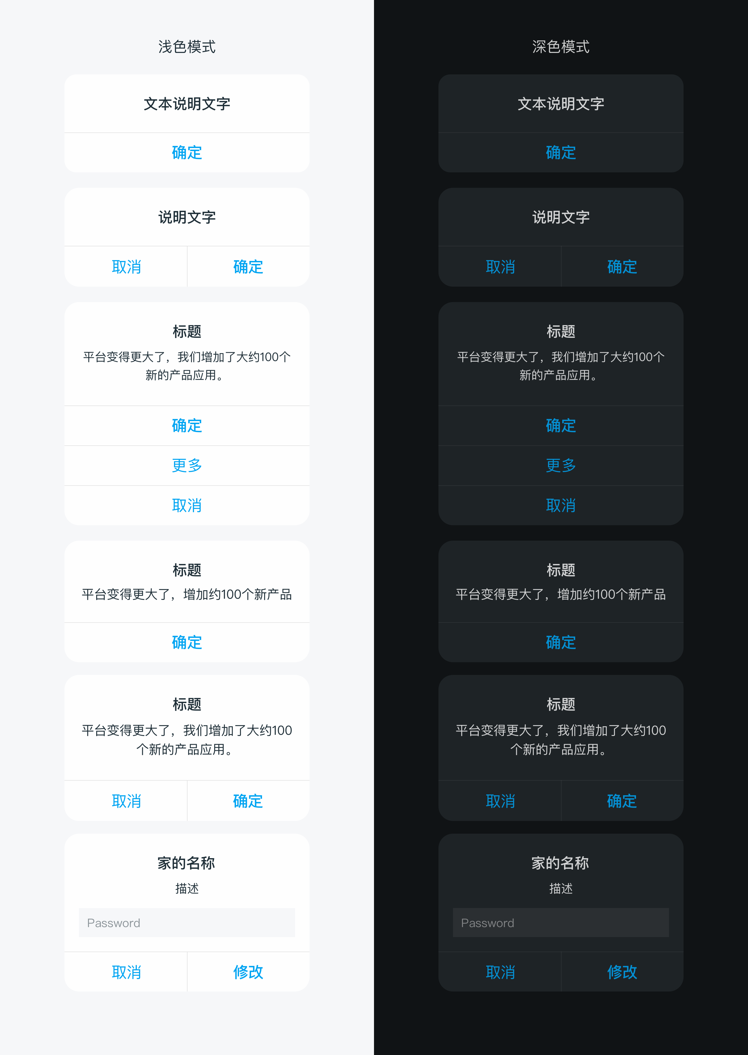
# dof-modal
弹窗的模态框组件
# 实例
# 基础用法
<template>
  <div class="dof-modal-wrapper">
    <dof-minibar title="Modal" background-color="#267AFF" text-color="#ffffff" :left-button="leftButton"></dof-minibar>
    <scroller class="scroller">
      <dof-catalog title="使用案例" background-color="#daf9ca" :has-margin="true"></dof-catalog>
      <div class="container">
        <dof-button type="primary" class="eventBtn" text="一个按钮对话框" @dofButtonClicked="openSingleModal">
        </dof-button>
        <dof-button type="primary" class="eventBtn" text="两个按钮对话框" @dofButtonClicked="openModal"> </dof-button>

        <dof-button type="primary" class="eventBtn" text="一个按钮带描述" @dofButtonClicked="openSingleContentModal">
        </dof-button>
        <dof-button type="primary" class="eventBtn" text="两个按钮带描述" @dofButtonClicked="openContentModal">
        </dof-button>

        <dof-button type="primary" class="eventBtn" text="带描述、输入框和两个按钮" @dofButtonClicked="openPromptModal">
        </dof-button>
        <dof-button type="primary" class="eventBtn" text="带描述和多个按钮" @dofButtonClicked="openMoreBtnModal">
        </dof-button>
        <dof-button type="colmo" class="eventBtn" text="打开图片弹窗" @dofButtonClicked="showImgModal = true">
        </dof-button>
        <dof-button type="colmo" class="eventBtn" text="打开单选弹窗" @dofButtonClicked="showSelectModal = true">
        </dof-button>
      </div>
    </scroller>

    <dof-modal
      title="文本"
      :show="show"
      @close="closeModal"
      @dofModalCancelBtnClicked="dofModalCancelBtnClicked"
      @dofModalConfirmBtnClicked="dofModalConfirmBtnClicked"
      :single="single"
    >
    </dof-modal>
    <dof-modal
      title="标题"
      content="Platforma goes bigger – we added about 100 new screens."
      :show="showContent"
      @close="closeModal"
      @dofModalCancelBtnClicked="dofModalCancelBtnClicked"
      @dofModalConfirmBtnClicked="dofModalConfirmBtnClicked"
      :single="single"
    >
    </dof-modal>
    <dof-modal
      title="家的名称"
      content="Subtitle"
      :show="showPrompt"
      hasInput="true"
      :inputContent="inputContent"
      placeholder="Password"
      confirmText="修改"
      @close="closeModal"
      @dofModalCancelBtnClicked="dofModalCancelBtnClicked"
      @dofModalConfirmBtnClicked="dofModalConfirmBtnClicked"
    >
    </dof-modal>
    <dof-modal
      title="标题"
      content="Platforma goes bigger – we added about 100 new screens."
      :show="showMoreBtn"
      :btnGroup="moreBtnGroup"
      @close="closeModal"
      @btnItemClicked="moreBtnClicked"
    >
    </dof-modal>

    <dof-modal
      :show="showImgModal"
      @close="showImgModal = false"
      @dofModalConfirmBtnClicked="showImgModal = false"
      @dofModalCancelBtnClicked="showImgModal = false"
      :single="false"
      :main-btn-color="'#B35336'"
      :second-btn-color="'#71717A'"
      :modal-style="{ ...modalStyle }"
      :modal-footer-border-color="'#3D3D42'"
      :sub-text-color="'#cccccc'"
      :image="'./assets/image/modal/img.png'"
      :img-style="imgStyle"
      :modal-content-style="{ paddingLeft: '0px', paddingRight: '0px' }"
    >
      <text class="titleText" slot="title">检测到新版本</text>
      <div class="contentTextBox" slot="content">
        <text class="contentText">{{ content }}</text>
      </div>
    </dof-modal>
    <dof-modal
      :show="showSelectModal"
      @close="showSelectModal = false"
      @dofModalConfirmBtnClicked="showSelectModal = false"
      @closeIconClicked="showSelectModal = false"
      :btn-group="null"
      :modal-style="{ ...modalStyle }"
      :image="'./assets/image/modal/img.png'"
      :img-style="imgStyle"
      :modal-content-style="{ paddingLeft: '0px', paddingRight: '0px' }"
      :closeIcon="'./assets/image/modal/close.png'"
    >
      <text class="titleText" slot="title">检测到新版本</text>
      <div slot="content">
        <text class="contentTitle">狗粮小盆</text>
        <text class="contentTip">识别准确率 98%</text>

        <div class="contentTextBox">
          <text class="contentText">{{ content }}</text>
        </div>
        <div class="selectBox">
          <div>
            <div :class="['selectItem', selectVal === 1 ? 'active' : '']" @click="selectVal = 1">
              <image class="selectImg" src="./assets/image/modal/good.png"></image>
            </div>
            <text class="selectText">准确好用</text>
          </div>
          <div>
            <div :class="['selectItem', selectVal === 2 ? 'active' : '']" @click="selectVal = 2">
              <image class="selectImg" src="./assets/image/modal/bad.png"></image>
            </div>
            <text class="selectText">仍需努力</text>
          </div>
        </div>
      </div>
    </dof-modal>
  </div>
</template>

<style scoped>
.dof-modal-wrapper {
  background-color: #f2f2f2;
}

.scroller {
  flex: 1;
}

.container {
  flex-direction: column;
  align-items: center;
}

.eventBtn {
  margin: 24px auto;
}
.custom-content {
  font-family: PingFangSC-Regular;
  font-size: 32px;
  color: #000000;
  text-align: center;
  padding-bottom: 10px;
}
.titleText {
  font-family: PingFangSC-Medium;
  font-size: 34px;
  color: #ffffff;
  text-align: center;
  font-weight: 500;

  lines: 1;
  text-overflow: ellipsis;
  overflow: hidden;
  padding: 0px 50px;
}
.contentTextBox {
  display: flex;
  flex-direction: row;
  justify-content: center;
  margin-bottom: 20px;
}
.contentText {
  width: 480px;
  font-family: PingFangSC-Regular;
  font-size: 26px;
  color: #cccccc;
  text-align: center;
  font-weight: 400;
}
.contentTitle {
  font-family: PingFangSC-Medium;
  font-size: 34px;
  color: #ffffff;
  text-align: center;
  font-weight: 500;
}
.contentTip {
  font-family: PingFangSC-Light;
  font-size: 26px;
  color: #b35336;
  text-align: center;
  font-weight: 200;
  margin-top: 12px;
  margin-bottom: 16px;
}
.selectBox {
  display: flex;
  flex-direction: row;
  justify-content: space-between;
  padding-left: 86px;
  padding-right: 86px;
  margin-top: 44px;
  margin-bottom: 66px;
}
.selectItem {
  width: 96px;
  height: 96px;
  background-color: #27272a;
  display: flex;
  flex-direction: row;
  align-items: center;
  justify-content: center;
  border-radius: 48px;
}
.selectImg {
  width: 60px;
  height: 60px;
}
.active {
  background-color: #b35336;
}
.selectText {
  margin-top: 14px;
  font-family: PingFangSC-Regular;
  font-size: 24px;
  color: #ffffff;
  text-align: center;
  font-weight: 400;
}
</style>

<script>
import { DofButton, DofModal, DofMinibar, DofCatalog } from 'dolphin-weex-ui'
const modal = weex.requireModule('modal')
module.exports = {
  components: { DofButton, DofModal, DofMinibar, DofCatalog },
  data() {
    return {
      leftButton: 'http://dolphin-weex-dev.msmartlife.cn/cdn/images/header/icon_back_white@3x.png',
      show: false,
      single: false,
      showContent: false,
      showPrompt: false,
      inputContent: '',
      showMoreBtn: false, // 多个button的dialog
      showImgModal: false,
      showSelectModal: false,
      moreBtnGroup: ['确定', '更多', '取消'],
      modalStyle: {
        borderRadius: '0px', // 弹窗是否圆角
        backgroundColor: '#1A1A1C' // 弹窗背景颜色
      },
      content: '小美提醒:定期收纳整理,保持地面整齐,清洁体验更佳。',
      imgStyle: { marginTop: '40px', marginBottom: '40px', width: '540px', height: '332px' },
      selectVal: 1,
      activeTab: 0
    }
  },
  methods: {
    openModal() {
      this.single = false
      this.show = true
    },
    openSingleModal() {
      this.single = true
      this.show = true
    },

    openContentModal() {
      this.single = false
      this.showContent = true
    },
    openSingleContentModal() {
      this.single = true
      this.showContent = true
    },

    // 打开带描述和输入框的对话框
    openPromptModal() {
      this.showPrompt = true
    },

    // 打开带描述和多个按钮的对话框
    openMoreBtnModal() {
      this.showMoreBtn = true
    },

    dofModalConfirmBtnClicked(params) {
      console.log('this.inputContent', this.inputContent)
      console.log('params', params)
      this.show = false
      this.showContent = false
      this.showPrompt = false
      if (params.content) {
        modal.toast({
          message: `您点击了${params.type}按钮,修改为${params.content}`
        })
        this.inputContent = params.content
      } else {
        modal.toast({
          message: `您点击了${params.type}按钮`
        })
      }
    },

    dofModalCancelBtnClicked(params) {
      console.log('params', params)
      this.show = false
      this.showContent = false
      this.showPrompt = false
      modal.toast({
        message: '您点击了cancel按钮'
      })
    },

    //按钮组点击
    moreBtnClicked(params) {
      console.log(params)
      this.showMoreBtn = false
      modal.toast({
        message: `您点击了'${params.text}'按钮`
      })
    },

    closeModal() {
      this.show = false
    },

    back() {}
  },
  created() {
    // this.isIos = weex.config.env.platform === 'iOS';
  }
}
</script>
1
2
3
4
5
6
7
8
9
10
11
12
13
14
15
16
17
18
19
20
21
22
23
24
25
26
27
28
29
30
31
32
33
34
35
36
37
38
39
40
41
42
43
44
45
46
47
48
49
50
51
52
53
54
55
56
57
58
59
60
61
62
63
64
65
66
67
68
69
70
71
72
73
74
75
76
77
78
79
80
81
82
83
84
85
86
87
88
89
90
91
92
93
94
95
96
97
98
99
100
101
102
103
104
105
106
107
108
109
110
111
112
113
114
115
116
117
118
119
120
121
122
123
124
125
126
127
128
129
130
131
132
133
134
135
136
137
138
139
140
141
142
143
144
145
146
147
148
149
150
151
152
153
154
155
156
157
158
159
160
161
162
163
164
165
166
167
168
169
170
171
172
173
174
175
176
177
178
179
180
181
182
183
184
185
186
187
188
189
190
191
192
193
194
195
196
197
198
199
200
201
202
203
204
205
206
207
208
209
210
211
212
213
214
215
216
217
218
219
220
221
222
223
224
225
226
227
228
229
230
231
232
233
234
235
236
237
238
239
240
241
242
243
244
245
246
247
248
249
250
251
252
253
254
255
256
257
258
259
260
261
262
263
264
265
266
267
268
269
270
271
272
273
274
275
276
277
278
279
280
281
282
283
284
285
286
287
288
289
290
291
292
293
294
295
296
297
298
299
300
301
302
303
304
305
306
307
308
309
310
311
312
313
314
315
316
317
318
319
320
321
322
323
324
325
326
327
328
329
330
331
332
333
334
# Attributes
| Prop | Type | Required | Default | Description |
|---|---|---|---|---|
| show | Boolean | N | false | 是否显示 |
| single | Boolean | N | false | modal是否为一个按钮 |
| title | String | N | - | 标题 |
| content | String | N | - | modal的文本内容 |
| cancel-text | String | N | 取消 | modal的左边按钮默认label |
| confirm-text | String | N | 确定 | modal的右边按钮默认label,ps:single为true时默认显示的是右边的'确认按钮' |
| has-input | Boolean | N | - | 是否有输入框 |
| placeholder | String | N | - | 输入框的placeholder |
| input-content | String | N | - | 输入框的绑定内容 |
| btn-group | Array | N | [] | 竖向多按钮组 例:['确定','更多','取消'] |
| main-btn-color | String | N | #267AFF | 单个按钮字体颜色或者右边按钮的字体颜色 |
| second-btn-color | String | N | #267AFF | 两个按钮左边按钮的字体颜色或者btnGroup按钮组字体颜色 |
| modal-style | Object | N | {} | modal样式自定义 |
| modal-content-style | Object | N | {} | modal-content样式自定义,适用于修改内部padding等需求 |
| modal-footer-border-color | String | N | #c8c7cc | 底部按钮边框颜色 |
| image | String | N | - | 图片地址 |
| imgStyle | Object | N | {} | 图片样式 |
| closeIcon | String | N | - | 右上角关闭按钮地址 |
# Events
| 事件名 | 说明 | 回调参数 |
|---|---|---|
dofModalCancelBtnClicked | 点击左边取消按钮 | e, e.type, e.content 见注1 |
dofModalConfirmBtnClicked | 点击右边确定按钮 | e, e.type, e.content 见注1 |
btnItemClicked | 多按钮组点击事件 | e, 参数e返回列表项信息为{index, text} |
close | 模态窗关闭 | {} |
- 注1: e.type为cancel或者comfirm, e.content为返回的input内容
# 底部弹窗
从底部出现的弹窗
# dof-actionsheet
动作面板(底部弹窗)
# 实例
# 基础用法
<template>
  <div class="wrapper">
    <dof-minibar
      title="actionSheet"
      background-color="#267AFF"
      @dofMinibarLeftButtonClicked="back"
      :left-button="leftButton"
      text-color="#ffffff"
      right-text="more"
    ></dof-minibar>
    <scroller class="scroller">
      <title title="dof-actionsheet"></title>
      <category title="使用案例"></category>
      <div class="container">
        <dof-button @dofButtonClicked="openAction1" text="actionsheet动作面板+有标题"></dof-button>
        <dof-button @dofButtonClicked="openAction2" text="actionsheet动作面板+无标题"></dof-button>
      </div>
      <dof-actionsheet :show="isBottomShow"
                  :title="title"
                  :items="items"
                  @dofPopupOverlayClicked="isBottomShow=false"
                  @dofItemClick="itemClick"
                  @dofCancelClick="cancelClick">
      </dof-actionsheet>
    </scroller>
  </div>
</template>

<style scoped>
  .wrapper {
    position: absolute;
    top: 0;
    bottom: 0;
    left: 0;
    right: 0;
    background-color: #FFFFFF;
  }
  .scroller {
    flex: 1;
  }
  .container{
    height: 400px;
    justify-content: space-around;
    align-items: center;
  }
</style>

<script>
import { DofMinibar, DofActionsheet, DofButton } from 'dolphin-weex-ui'
import Title from 'src/_mods/title.vue'
import Category from 'src/_mods/catalog'
const modal = weex.requireModule('modal');
export default {
  components: { Title, Category, DofMinibar, DofActionsheet, DofButton },
  data: () => ({
    isBottomShow: false,
    title:'',
    items:['确定', '更多']
  }),
  created() {},

  methods: {
    openAction1(){
      this.title = '我是标题'
      this.isBottomShow = true;
    },
    openAction2(){
      this.title = ''
      this.isBottomShow = true;
    },
    itemClick(params){
      modal.toast({
        message: JSON.stringify(params)
      });
    },
    cancelClick(params){
      modal.toast({
        message: JSON.stringify(params)
      });
    }
  }
}
</script>
1
2
3
4
5
6
7
8
9
10
11
12
13
14
15
16
17
18
19
20
21
22
23
24
25
26
27
28
29
30
31
32
33
34
35
36
37
38
39
40
41
42
43
44
45
46
47
48
49
50
51
52
53
54
55
56
57
58
59
60
61
62
63
64
65
66
67
68
69
70
71
72
73
74
75
76
77
78
79
80
81
82
83
2
3
4
5
6
7
8
9
10
11
12
13
14
15
16
17
18
19
20
21
22
23
24
25
26
27
28
29
30
31
32
33
34
35
36
37
38
39
40
41
42
43
44
45
46
47
48
49
50
51
52
53
54
55
56
57
58
59
60
61
62
63
64
65
66
67
68
69
70
71
72
73
74
75
76
77
78
79
80
81
82
83
# Attributes
| Prop | Type | Required | Default | Description |
|---|---|---|---|---|
show | Boolean | N | false | 是否显示actionsheet列表 |
title | String | N | - | 上拉面板的title |
button | String | N | 取消 | 上拉面板的默认按钮,目前只支持单个按钮,类似取消,不用了 |
items | Array | Y | - | 上拉列表,例:item:['确定', '更多'] |
titleStyle | Object | N | {} | title 样式 |
defaultBtnStyle | Object | N | {} | 默认按钮样式 |
itemStyle | Objct | N | {} | items 中按钮外层样式(非文本样式) |
# Events
| 事件名称 | 说明 | 回调参数 |
|---|---|---|
dofPopupOverlayClicked | 蒙层点击关闭事件 | e |
dofItemClick | 上拉列表选项点击事件 | e, 参数e返回列表项信息为{ item, index } |
dofCancelClick | 点击取消按钮事件 | e,e.buttonText |
# Attention:
由于组件关闭是使用方法dofPopupOverlayClicked在前端更新show状态的,故使用时务必在dofPopupOverlayClicked方法中将show设置为false,否则由于不能更新当前状态导致下次不能正确打开,如下:
<script>
  <dof-actionsheet
      :show="isBottomShow"
      :items="items"
      @dofPopupOverlayClicked="isBottomShow=false">
  </dof-actionsheet>
</script>
1
2
3
4
5
6
7
2
3
4
5
6
7
# 其他弹窗
自定义弹窗

# dof-mask弹出层
弹层组件,可定制内容
# 实例
# 基础用法
<template>
  <div class="wrapper">
    <dof-minibar
      title="mask"
      background-color="#267AFF"
      text-color="#ffffff"
      :left-button="leftButton"
      @dofMinibarLeftButtonClicked="back"
      left-text="返回"
    ></dof-minibar>

   <div class="container">
      <dof-button
        class="btn"
        type="primary"
        text="打开mask"
        @dofButtonClicked="openMask">
      </dof-button>
   </div>

    <dof-mask height="700"
              width="540"
              duration="300"
              mask-bg-color="#FFFFFF"
              :has-overlay="true"
              :show-close="true"
              :show="show"
              border-radius="26"
              @dofMaskSetHidden="dofMaskSetHidden">
        <div class="content">
          <dof-image :src="activityImg"
                      resize="stretch"
                      @click="imgClick"
                      class="activityImg"></dof-image>
        </div>
      </dof-mask>
  </div>
</template>

<style scoped>
 .wrapper {
   background-color: #f2f2f2;
  }

  .container {
    justify-content: center;
    align-items: center;
  }
  .btn{
    margin:40px auto;
  }

  .content{
    width: 540px;
    height: 700px;
    border-radius: 26px;
    overflow: hidden;
  }

  .activityImg{
    width: 540px;
    height: 700px;
  }
</style>

<script>
import { DofButton, DofMinibar, DofMask, DofImage } from 'dolphin-weex-ui'
const modal = weex.requireModule('modal');

export default {
  components: { DofButton, DofMinibar, DofMask ,DofImage},
  data() {
    return {
      leftButton: 'assets/img/header/TB1cAYsbv2H8KJjy0FcXXaDlFXa-30-53.png',
      show: false,
      activityImg:'assets/img/image/activity.png'
    }
  },
  methods: {
     openMask (e) {
        this.show = true;
      },

      dofMaskSetHidden () {
        this.show = false;
         modal.toast({
          message: `您点击了close按钮`
        });
      },

      imgClick(){
        modal.toast({
          message: `您点击了图片按钮`
        });
      }
  }
}
</script>
1
2
3
4
5
6
7
8
9
10
11
12
13
14
15
16
17
18
19
20
21
22
23
24
25
26
27
28
29
30
31
32
33
34
35
36
37
38
39
40
41
42
43
44
45
46
47
48
49
50
51
52
53
54
55
56
57
58
59
60
61
62
63
64
65
66
67
68
69
70
71
72
73
74
75
76
77
78
79
80
81
82
83
84
85
86
87
88
89
90
91
92
93
94
95
96
97
98
2
3
4
5
6
7
8
9
10
11
12
13
14
15
16
17
18
19
20
21
22
23
24
25
26
27
28
29
30
31
32
33
34
35
36
37
38
39
40
41
42
43
44
45
46
47
48
49
50
51
52
53
54
55
56
57
58
59
60
61
62
63
64
65
66
67
68
69
70
71
72
73
74
75
76
77
78
79
80
81
82
83
84
85
86
87
88
89
90
91
92
93
94
95
96
97
98
# Attributes
| Prop | Type | Required | Default | Description |
|---|---|---|---|---|
| show | Bool | Y | false | 是否显示 |
| width | Number | Y | 540 | 面板的宽度 |
| height | Number | Y | 800 | 面板的高度 |
| top | Number | N | 0 | 面板的 top 值,为 0 时垂直居中面板 |
| border-radius | Number | N | 32 | 弹出层的 border-radius |
| duration | String | N | 300 | 弹层出现过渡时间 |
| show-close | Bool | N | true | 是否显示下面的关闭按钮 |
| has-overlay | Bool | N | true | 是否有蒙层 |
| mask-bg-color | String | N | transparent | mask 的背景颜色 |
# Slot
<slot></slot>:mask匿名插槽,可直接在mask标签内直接使用,替换默认 slot 占位
# Events
| 事件名 | 说明 | 回调参数 |
|---|---|---|
dofMaskSetHidden | - | 关闭mask蒙层事件 |