# 4.4 多选框(Check box)
用于在一组可选项中进行多项选择时。
# 图标
# 正常
切图大小:24pt * 24pt (实际蓝色部分直径22pt)
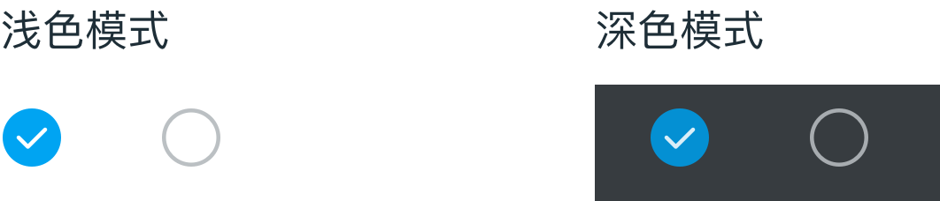
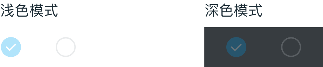
# 禁用
正常情况下,不透明度 30%
# 多选框样式
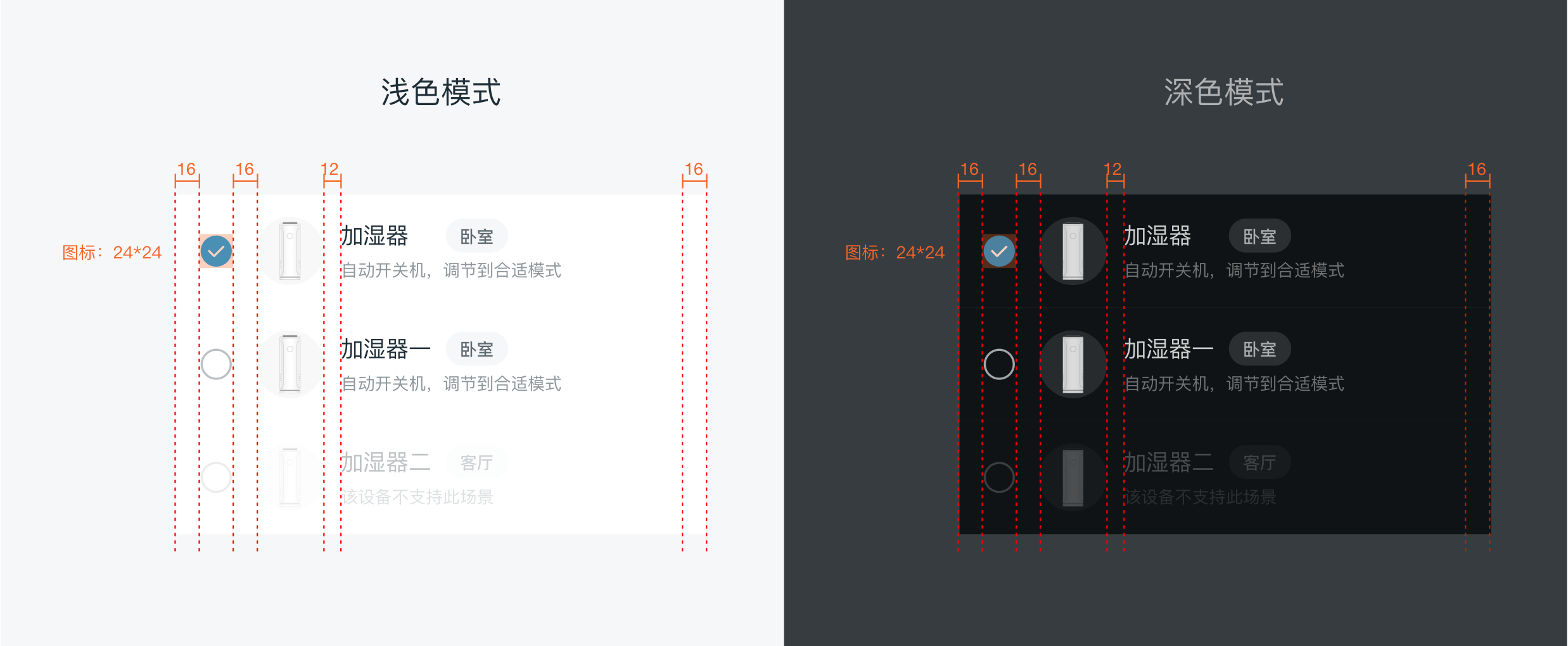
# dof-checkbox复选框
复选框组件,建议以成组的方式出现,使用dof-checkbox-list
# 实例
# 基础用法
<template>
  <div class="wrapper">
    <dof-minibar
      title="checkbox"
      background-color="#00A4F2"
      text-color="#ffffff"
      :left-button="leftButton"
    ></dof-minibar>
    <scroller>
      <div style="padding-top:32px;padding-left:32px; padding-bottom:20px ">
        <text style="font-size:28px;color: #616C73;">加湿器 当前选中 {{ checkedList.toString() }}</text>
      </div>
      <dof-checkbox-list
        :list="list"
        :needShowTopBorder="false"
        @dofCheckBoxListChecked="CheckBoxClicked"
        style="background-color: #ffffff;"
      >
      </dof-checkbox-list>
    </scroller>
  </div>
</template>

<style scoped>
.wrapper {
  background-color: #ffffff;
  position: relative;
}
.describeText {
  font-family: 'PingFangSC-Regular';
  font-size: 24px;
  color: #616c73;
  line-height: 32px;
  margin: 32px;
}

.detailBtn {
  font-size: 22px;
  color: #8e969b;
  background-color: #f2f2f2;
  border-radius: 24px;
  margin-left: 32px;
  margin-top: -10px;
  text-align: center;
  width: 140px;
  height: 44px;
  line-height: 44px;
}

.subTitle {
  font-family: 'PingFangSC-Regular';
  font-size: 28px;
  color: #616c73;
  margin-left: 32px;
  margin-top: 24px;
  margin-bottom: 20px;
}

.container {
  justify-content: center;
  align-items: center;
}
.btn {
  margin-top: 48px;
}

.warningTips {
  font-family: PingFangSC-Medium;
  color: #ff9500;
  font-size: 24px;
  margin-top: 24px;
}
</style>

<script>
import { DofButton, DofMinibar, DofCheckbox, DofCheckboxList, DofCell2, DofCard, Core } from 'dolphin-weex-ui'
import Title from 'src/_mods/title.vue'
import Category from 'src/_mods/catalog'
import { setTitle } from 'src/_mods/set-nav'
const modal = weex.requireModule('modal')

module.exports = {
  components: { Title, Category, DofButton, DofMinibar, DofCheckbox, DofCheckboxList, DofCell2, DofCard },
  data() {
    return {
      itemImg: '',
      leftButton: 'http://dolphin-weex-dev.msmartlife.cn/cdn/images/header/icon_back_white@3x.png',
      describeText:
        '通过空调、空气净化器、加湿器、环境检测仪的智能联动,为你打造一段气温凉爽、湿度适宜、空气清新的山居岁月。',
      list: [
        {
          title: '加湿器',
          value: 1,
          tag: '卧室',
          desc: '自动开关机,调节到合适模式',
          itemImg: 'http://dolphin-weex-dev.msmartlife.cn/cdn/images/smart/ico_smart_08@3x.png'
        },
        {
          title: '风扇',
          value: 2,
          checked: true,
          tag: '卧室',
          desc: '自动开关机,调节到合适模式',
          itemImg: 'http://dolphin-weex-dev.msmartlife.cn/cdn/images/smart/ico_smart_01@3x.png'
        },
        {
          title: '空调',
          value: 3,
          tag: '卧室',
          desc: '自动开关机,调节到合适模式',
          itemImg: 'http://dolphin-weex-dev.msmartlife.cn/cdn/images/smart/ico_smart_15@3x.png'
        },
        {
          title: '厨热',
          value: 4,
          disabled: true,
          tag: '卧室',
          desc: '自动开关机,调节到合适模式',
          itemImg: 'http://dolphin-weex-dev.msmartlife.cn/cdn/images/smart/ico_smart_05@3x.png'
        }
      ],
      checkedList: [2]
    }
  },
  created() {
    setTitle('Accordion')
  },
  methods: {
    CheckBoxClicked(e) {
      console.log('e', e)
      this.checkedList = e.checkedList
    },

    cardClickedHandler() {
      Core.toast('card clicked')
    },
    back() {},
    minibarRightButtonClick() {
      const home = 'index.js'
      this.$MID.platform.name.toLowerCase() !== 'web' && this.$MID.route.push(home)
    }
  },
  computed: {
    noBorderRadius() {
      return {
        borderRadius: 0
      }
    },
    smallFontModel() {
      return {
        fontSize: '24px',
        color: '#8E969B',
        lineHeight: '34px'
      }
    }
  }
}
</script>
1
2
3
4
5
6
7
8
9
10
11
12
13
14
15
16
17
18
19
20
21
22
23
24
25
26
27
28
29
30
31
32
33
34
35
36
37
38
39
40
41
42
43
44
45
46
47
48
49
50
51
52
53
54
55
56
57
58
59
60
61
62
63
64
65
66
67
68
69
70
71
72
73
74
75
76
77
78
79
80
81
82
83
84
85
86
87
88
89
90
91
92
93
94
95
96
97
98
99
100
101
102
103
104
105
106
107
108
109
110
111
112
113
114
115
116
117
118
119
120
121
122
123
124
125
126
127
128
129
130
131
132
133
134
135
136
137
138
139
140
141
142
143
144
145
146
147
148
149
150
151
152
153
154
155
156
157
158
159
# Attributes
| Prop | Type | Required | Default | Description |
|---|---|---|---|---|
title | String | Y | - | checkbox展现的label |
value | [String、Number、Object] | Y | - | checkbox展现的value |
checked | Boolean | N | false | checkbox是否选中 |
disabled | Boolean | N | false | 是否 disabled |
item-img | String | N | - | 覆盖颜色和 icon |
tag | String | N | - | 标题旁边的胶囊按钮 |
desc | String | N | - | 标题下方的描述文本内容 |
has-top-border | Boolean | N | false | 是否显示上边 |
has-bottom-border | Boolean | N | false | 是否显示下边 |
has-sub-top-border | Boolean | N | false | 是否显示上内边 |
has-sub-bottom-border | Boolean | N | true | 是否显示下内边 |
# Events
| 事件名称 | 说明 | 回调参数 |
|---|---|---|
dofCheckBoxListChecked | 多选列表选项点击事件 | e, 参数e返回已选项value信息为{ checkedList } |