# 7.2 弹出层
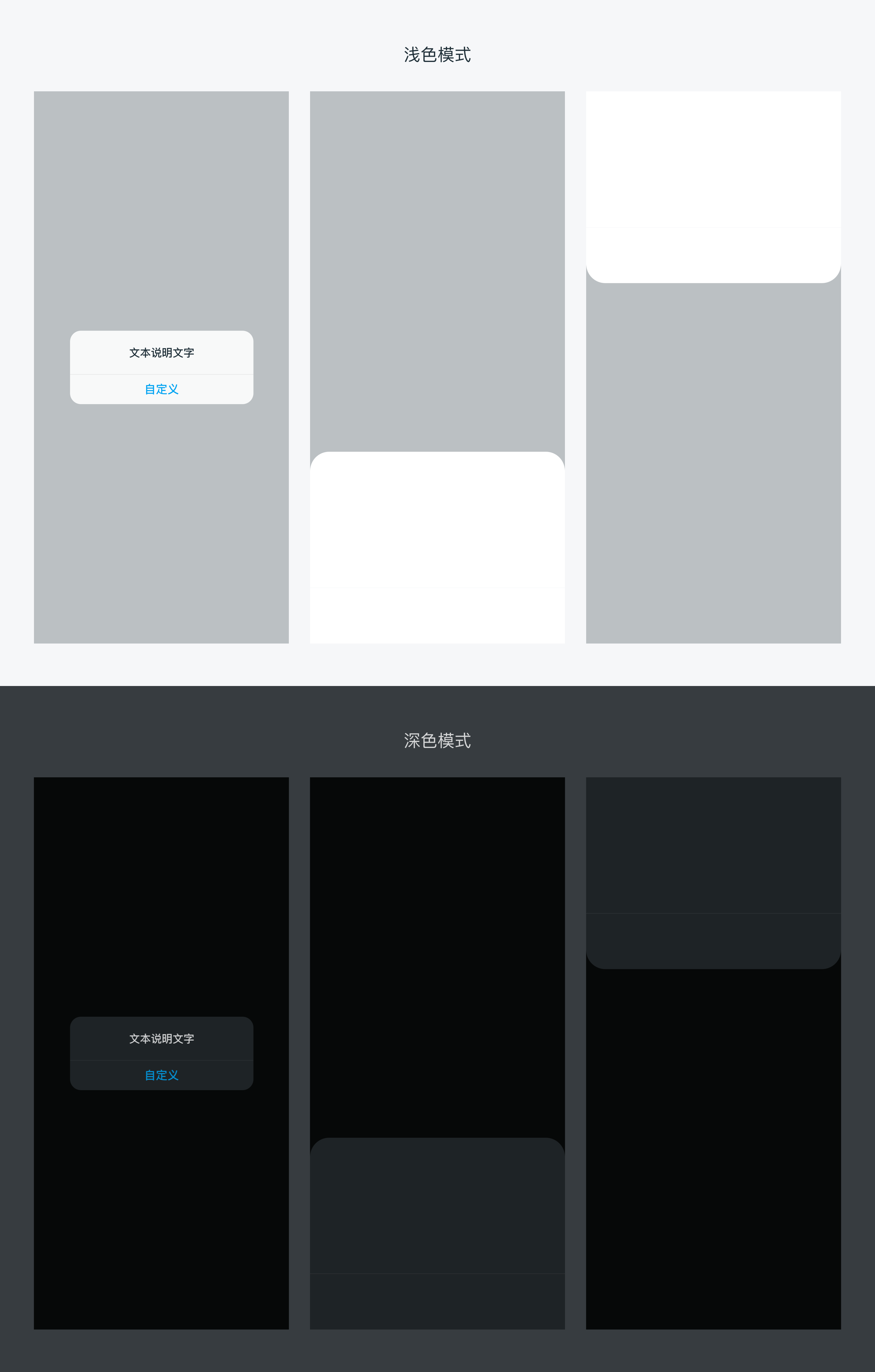
用于弹窗出现时,让用户聚焦弹窗内容
# 类型
浅色模式时:遮罩黑色 #1E2E37 30%,深色模式时:遮罩黑色 #000000 60%
# 实例
### 基础用法<template>
<scroller class="scroller">
<div class="container">
<dof-button @dofButtonClicked="openTopPopup" text="点击弹出顶部面板"></dof-button>
<dof-button @dofButtonClicked="openBottomPopup" text="点击弹出底部面板"></dof-button>
<dof-button @dofButtonClicked="openLeftPopup" text="点击弹出左侧面板"></dof-button>
<dof-button @dofButtonClicked="openRightPopup" text="点击弹出右侧面板"></dof-button>
<dof-button @dofButtonClicked="openImagePopup" text="上拉面板+自定义内容"></dof-button>
<dof-button @dofButtonClicked="openTextPopup" text="上拉面板+文字列表"></dof-button>
</div>
<dof-popup :show="isTopShow"
pos="top"
@dofPopupOverlayClicked="isTopShow=false">
</dof-popup>
<dof-popup :show="isBottomShow"
@dofPopupOverlayClicked="isBottomShow=false"
pos="bottom"
:height="400">
<scroller class="test">
<text class="text" v-for="i in 10" :key="i" >匿名插槽</text>
</scroller>
</dof-popup>
<dof-popup :width="500"
:show="isLeftShow"
@dofPopupOverlayClicked="isLeftShow=false"
pos="left"></dof-popup>
<dof-popup :width="400"
:show="isRightShow"
pos="right"
ref="dofPopup"
@dofPopupOverlayClicked="isRightShow=false">
<dof-button class="hideBtn" @dofButtonClicked="onHideClick" size="medium" text="主动隐藏试试"></dof-button>
</dof-popup>
<!-- image popup -->
<dof-popup :height="544"
:show="imageShow"
pos="bottom"
:button="button"
@dofPopupOverlayClicked="imageShow=false"
@dofPopupButtonClicked="popupButtonClicked">
<div class="contentSlot">
<div class="subTitle">发现新设备</div>
<dof-image v-if="itemImg&&itemImg!=''" :src="itemImg" class="itemImg"></dof-image>
</div>
</dof-popup>
<!-- text popup -->
<dof-popup :height="620"
:show="textShow"
pos="bottom"
@dofPopupOverlayClicked="textShow=false">
<div class="contentSlot">
<text class="leftTitle">场景详细设置</text>
<scroller class="scroller">
<text class="listItem" :key='index' v-for="(item, index) in textlist" >{{index+1}}.{{item.text}}</text>
</scroller>
</div>
</dof-popup>
</scroller>
</template>
<style scoped>
.dof-demo {
position: absolute;
top: 0;
bottom: 0;
left: 0;
right: 0;
background-color: #FFFFFF;
}
.scroller {
flex: 1;
}
.container{
height: 800px;
justify-content: space-around;
align-items: center;
}
.test{
width: 750px;
height: 360px;
}
.text {
margin: 40px;
color: #000000;
}
.hideBtn{
margin-top: 120px;
margin-left: 60px;
}
.contentSlot{
flex-direction: column;
align-items: center;
flex: 1;
}
.subTitle{
font-size: 36px;
margin: 40px auto;
}
.leftTitle{
width: 750px;
font-size: 32px;
line-height: 108px;
text-align: left;
padding-left: 32px;
border-bottom-style: solid;
border-bottom-width: 1px;
border-bottom-color: #E5E5E5;
}
.itemImg{
width: 280px;
height: 280px;
margin: 0 auto 40px;
}
.listItem{
font-size: 28px;
line-height: 70px;
text-align: justify;
}
</style>
<script>
import { DofPopup, DofMinibar, DofButton, DofImage } from 'dolphin-weex-ui'
const modal = weex.requireModule('modal');
export default {
components: { DofPopup, DofMinibar, DofButton, DofImage },
data: () => ({
isBottomShow: false,
isTopShow: false,
isLeftShow: false,
isRightShow: false,
imageShow:false,
button:['稍后添加', '立即添加'],
itemImg:"../../assets/img/image/22电饭煲.png",
textShow:false,
textlist:[
{text:'当室内湿度低于64%,打开加湿器并开启自动模式'},
{text:'当室内湿度高于68%,关闭加湿器'},
{text:'当室内湿度高于70%,打开空调并开启抽湿模式,风速自动'},
{text:'当室内湿度低于70%,打开空调并开启自动模式'},
{text:'当室内PM2.5>7,打开空气净化器并开启自动模式'},
{text:'当室内PM2.5<5,关闭空气净化器'}
],
}),
methods: {
openBottomPopup () {
this.isBottomShow = true;
},
openTopPopup () {
this.isTopShow = true;
},
openLeftPopup () {
this.isLeftShow = true;
},
openRightPopup () {
this.isRightShow = true;
},
openImagePopup(){
this.imageShow = true;
},
popupButtonClicked(params){
modal.toast({
message: `params:${JSON.stringify(params)}`
});
},
openTextPopup(){
this.textShow = true;
},
onHideClick () {
this.$refs.dofPopup.hide();
}
}
};
</script>
1
2
3
4
5
6
7
8
9
10
11
12
13
14
15
16
17
18
19
20
21
22
23
24
25
26
27
28
29
30
31
32
33
34
35
36
37
38
39
40
41
42
43
44
45
46
47
48
49
50
51
52
53
54
55
56
57
58
59
60
61
62
63
64
65
66
67
68
69
70
71
72
73
74
75
76
77
78
79
80
81
82
83
84
85
86
87
88
89
90
91
92
93
94
95
96
97
98
99
100
101
102
103
104
105
106
107
108
109
110
111
112
113
114
115
116
117
118
119
120
121
122
123
124
125
126
127
128
129
130
131
132
133
134
135
136
137
138
139
140
141
142
143
144
145
146
147
148
149
150
151
152
153
154
155
156
157
158
159
160
161
162
163
164
165
166
167
168
169
170
171
172
173
174
175
176
177
178
179
180
181
# Attributes
| Prop | Type | Required | Default | Description |
|---|---|---|---|---|
| show | Boolean | Y | false | 打开或关闭弹层 |
| pos | String | N | bottom | 弹出位置top/bottom/left/right |
| height | [Number, String] | N | 840 | 弹出层的高度(向上向下时候设置) |
| width | [Number, String] | N | 750 | 弹出层的宽度(向左向右时候设置) |
| button | Array | N | [] | 弹窗面板下方有按钮时使用, 例:['取消', '确定'] 或者: [{ text: '确定', textColor: '#f66' }, { text: '取消', textColor: '#666' }] |
| borderRadius | String | N | 32px | 圆角大小 |
# Events
| 事件名 | 说明 | 回调参数 |
|---|---|---|
dofPopupOverlayClicked | 关闭 | e e.pos |
dofPopupButtonClicked | 下方按钮点击事件 | e e.index, e.text |
# Slot
<slot></slot>:匿名插槽,可直接在dof-popup标签内直接使用,替换默认slot占位
# 主动调用关闭
在dof-popup上面绑定ref属性'refname',然后调用this.$refs[refname].hide();即可关闭,常用于自定义主动关闭,它比于直接将`show`属性设为`false`增加了过渡效果,比如在取消操作时可使用,示例代码如下:
1
<script>
  <dof-popup
      :show="show"
      ref='popup'
      @dofPopupOverlayClicked="isBottomShow=false">
     <dof-button @dofButtonClicked="onHideClick" size="medium" text="主动关闭"></dof-button>
  </dof-popup>

  onHideClick(){
    this.$refs['popup'].hide()
  }
</script>
1
2
3
4
5
6
7
8
9
10
11
12
2
3
4
5
6
7
8
9
10
11
12
# 备注
使用面板按钮时,只需要考虑按钮和间隔条的总高度`120px`即可,组件已针对iPhoneX及其他有Home Indicator的机型做了适配,无需开发者考虑。
1