# Toggle
说明:
该组件从API Version 8开始支持。后续版本如有新增内容,则采用上角标单独标记该内容的起始版本。
# 权限列表
无
# 子组件
仅当ToggleType为Button时可包含子组件。
# 接口
Toggle(options: { type: ToggleType, isOn?: boolean })
参数:
| 参数名 | 参数类型 | 必填 | 默认值 | 参数描述 |
|---|---|---|---|---|
| type | ToggleType | 是 | - | 开关类型。 |
| isOn | boolean | 否 | false | 开关是否打开,true:打开,false:关闭。 |
# ToggleType枚举说明
| 名称 | 描述 |
|---|---|
| Checkbox | 提供单选框样式。 > 说明: > 通用属性padding的默认值为: { top: 14 vp, right: 6 vp, bottom: 14 vp, left: 6 vp } |
| Button | 提供状态按钮样式,如果子组件有文本设置,则相应的文本内容会显示在按钮内部。 |
| Switch | 提供开关样式。 > 说明: > 通用属性padding默认值为: { top: 12 vp, right: 12 vp, bottom: 12 vp, left: 12 vp } |
# 属性
| 名称 | 参数 | 默认值 | 参数描述 |
|---|---|---|---|
| selectedColor | ResourceColor | - | 设置组件打开状态的背景颜色。 |
| switchPointColor | ResourceColor | - | 设置Switch类型的圆形滑块颜色。 > 说明: > 仅对type为ToggleType.Switch生效。 |
# 事件
| 名称 | 功能描述 |
|---|---|
| onChange(callback: (isOn: boolean) => void) | 开关状态切换时触发该事件。 |
# 示例
// xxx.ets
@Entry
@Component
struct ToggleExample {
build() {
Column({ space: 10 }) {
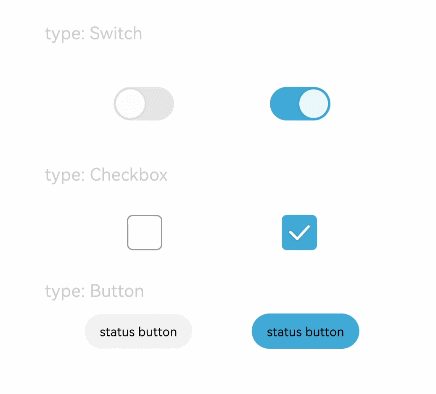
Text('type: Switch').fontSize(12).fontColor(0xcccccc).width('90%')
Flex({ justifyContent: FlexAlign.SpaceEvenly, alignItems: ItemAlign.Center }) {
Toggle({ type: ToggleType.Switch, isOn: false })
.selectedColor(0xed6f21)
.switchPointColor(0xe5ffffff)
.onChange((isOn: boolean) => {
console.info('Component status:' + isOn)
})
Toggle({ type: ToggleType.Switch, isOn: true })
.selectedColor(0x39a2db)
.switchPointColor(0xe5ffffff)
.onChange((isOn: boolean) => {
console.info('Component status:' + isOn)
})
}
Text('type: Checkbox').fontSize(12).fontColor(0xcccccc).width('90%')
Flex({ justifyContent: FlexAlign.SpaceEvenly, alignItems: ItemAlign.Center }) {
Toggle({ type: ToggleType.Checkbox, isOn: false })
.size({ width: 28, height: 28 })
.selectedColor(0xed6f21)
.onChange((isOn: boolean) => {
console.info('Component status:' + isOn)
})
Toggle({ type: ToggleType.Checkbox, isOn: true })
.size({ width: 28, height: 28 })
.selectedColor(0x39a2db)
.onChange((isOn: boolean) => {
console.info('Component status:' + isOn)
})
}
Text('type: Button').fontSize(12).fontColor(0xcccccc).width('90%')
Flex({ justifyContent: FlexAlign.SpaceEvenly, alignItems: ItemAlign.Center }) {
Toggle({ type: ToggleType.Button, isOn: false }) {
Text('status button').padding({ left: 12, right: 12 })
}
.selectedColor(0xed6f21)
.onChange((isOn: boolean) => {
console.info('Component status:' + isOn)
})
Toggle({ type: ToggleType.Button, isOn: true }) {
Text('status button').padding({ left: 12, right: 12 })
}
.selectedColor(0x39a2db)
.onChange((isOn: boolean) => {
console.info('Component status:' + isOn)
})
}
}.width('100%').padding(24)
}
}
1
2
3
4
5
6
7
8
9
10
11
12
13
14
15
16
17
18
19
20
21
22
23
24
25
26
27
28
29
30
31
32
33
34
35
36
37
38
39
40
41
42
43
44
45
46
47
48
49
50
51
52
53
54
55
56
57
58
59
60
61
62
2
3
4
5
6
7
8
9
10
11
12
13
14
15
16
17
18
19
20
21
22
23
24
25
26
27
28
29
30
31
32
33
34
35
36
37
38
39
40
41
42
43
44
45
46
47
48
49
50
51
52
53
54
55
56
57
58
59
60
61
62