# DataPanel
数据面板组件,用于将多个数据占比情况使用占比图进行展示。
说明:
该组件从API Version 7开始支持。后续版本如有新增内容,则采用上角标单独标记该内容的起始版本。
# 子组件
无
# 接口
DataPanel(options:{values: number[], max?: number, type?: DataPanelType})
参数:
| 参数名 | 参数类型 | 必填 | 参数描述 |
|---|---|---|---|
| values | number[] | 是 | 数据值列表,最大支持9个数据。 |
| max | number | 否 | - max大于0,表示数据的最大值。 - max小于等于0,max等于value数组各项的和,按比例显示。 默认值:100 |
| type8+ | DataPanelType | 否 | 数据面板的类型。 默认值:DataPanelType.Circle |
# DataPanelType枚举说明
| 名称 | 描述 |
|---|---|
| Line | 线型数据面板。 |
| Circle | 环形数据面板。 |
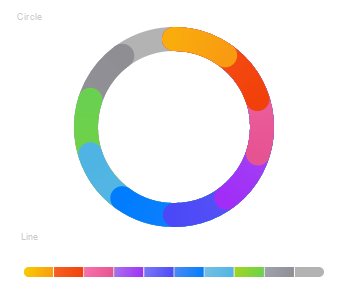
# 示例
// xxx.ets
@Entry
@Component
struct DataPanelExample {
  public values1: number[] = [10, 10, 10, 10, 10, 10, 10, 10, 10]

  build() {
    Column({ space: 5 }) {
      Text('Circle').fontSize(9).fontColor(0xCCCCCC).margin({ top: 20, right: '80%' })
      DataPanel({ values: this.values1, max: 100, type: DataPanelType.Circle }).width(200).height(200)

      Text('Line').fontSize(9).fontColor(0xCCCCCC).margin({ bottom: 20, right: '80%' })
      DataPanel({ values: this.values1, max: 100, type: DataPanelType.Line }).width(300).height(10)
    }.width('100%').margin({ top: 5 })
  }
}
1
2
3
4
5
6
7
8
9
10
11
12
13
14
15
16
2
3
4
5
6
7
8
9
10
11
12
13
14
15
16