# Divider
提供分隔器组件,分隔不同内容块/内容元素。
说明:
该组件从API Version 7开始支持。后续版本如有新增内容,则采用上角标单独标记该内容的起始版本。
# 子组件
无
# 接口
Divider()
# 属性
除支持通用属性外,还支持以下属性:
| 名称 | 参数类型 | 描述 |
|---|---|---|
| vertical | boolean | 使用水平分割线还是垂直分割线。false: 水平分割线, true: 垂直分割线。 默认值:false |
| color | ResourceColor | 分割线颜色。 |
| strokeWidth | number | string | 分割线宽度。 默认值:1 |
| lineCap | LineCapStyle | 分割线的端点样式。 默认值:LineCapStyle.Butt |
# 事件
不支持通用事件。
# 示例
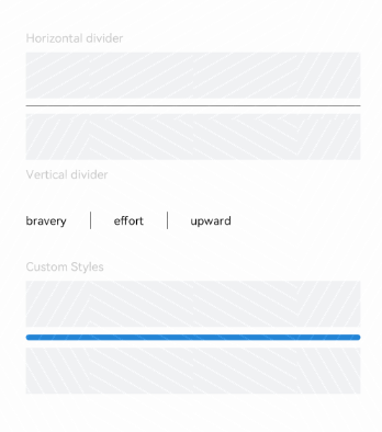
// xxx.ets
@Entry
@Component
struct DividerExample {
  build() {
    Flex({ direction: FlexDirection.Column, alignItems: ItemAlign.Start, justifyContent: FlexAlign.SpaceBetween }) {
      Text('Horizontal divider').fontSize(9).fontColor(0xCCCCCC)
      Row().width('100%').height(40).backgroundColor(0xF1F3F5)
      Divider()
      Row().width('100%').height(40).backgroundColor(0xF1F3F5)

      // 纵向分割线
      Text('Vertical divider').fontSize(9).fontColor(0xCCCCCC)
      Flex({ alignItems: ItemAlign.Center, wrap: FlexWrap.Wrap }) {
        Text('bravery')
        Divider().vertical(true).margin(20).height(15)
        Text('effort')
        Divider().vertical(true).margin(20).height(15)
        Text('upward')
      }.width(250)

      // 设置分割线宽度和端点样式
      Text('Custom Styles').fontSize(9).fontColor(0xCCCCCC)
      Row().width('100%').height(40).backgroundColor(0xF1F3F5)
      Divider().vertical(false).strokeWidth(5).color(0x2788D9).lineCap(LineCapStyle.Round)
      Row().width('100%').height(40).backgroundColor(0xF1F3F5)
    }.width('100%').height(350).padding({ left: 35, right: 35, top: 35 })
  }
}
1
2
3
4
5
6
7
8
9
10
11
12
13
14
15
16
17
18
19
20
21
22
23
24
25
26
27
28
29
2
3
4
5
6
7
8
9
10
11
12
13
14
15
16
17
18
19
20
21
22
23
24
25
26
27
28
29