# Select
提供下拉选择菜单,可以让用户在多个选项之间选择。
说明:
该组件从API Version 8开始支持。后续版本如有新增内容,则采用上角标单独标记该内容的起始版本。
# 子组件
无
# 接口
Select(options: Array<SelectOption>)
# SelectOption对象说明
| 参数名 | 参数类型 | 必填 | 参数描述 |
|---|---|---|---|
| value | ResourceStr | 是 | 下拉选项内容。 |
| icon | ResourceStr | 否 | 下拉选项图片。 |
# 属性
| 名称 | 参数类型 | 描述 |
|---|---|---|
| selected | number | 设置下拉菜单初始选项的索引,第一项的索引为0。 |
| value | string | 设置下拉按钮本身的文本内容。 |
| font | Font | 设置下拉按钮本身的文本样式。 |
| fontColor | ResourceColor | 设置下拉按钮本身的文本颜色。 |
| selectedOptionBgColor | ResourceColor | 设置下拉菜单选中项的背景色。 |
| selectedOptionFont | Font | 设置下拉菜单选中项的文本样式。 |
| selectedOptionFontColor | ResourceColor | 设置下拉菜单选中项的文本颜色。 |
| optionBgColor | ResourceColor | 设置下拉菜单项的背景色。 |
| optionFont | Font | 设置下拉菜单项的文本样式。 |
| optionFontColor | ResourceColor | 设置下拉菜单项的文本颜色。 |
# 事件
| 名称 | 功能描述 |
|---|---|
| onSelect(callback: (index: number, value?: string) => void) | 下拉菜单选中某一项的回调。 index:选中项的索引。 value:选中项的值。 |
# 示例
// xxx.ets
@Entry
@Component
struct SelectExample {
build() {
Column() {
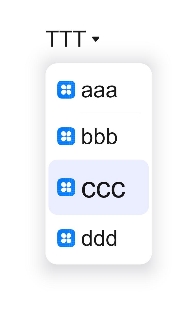
Select([{ value: 'aaa', icon: "/common/1.png" },
{ value: 'bbb', icon: "/common/2.png" },
{ value: 'ccc', icon: "/common/3.png" },
{ value: 'ddd', icon: "/common/4.png" }])
.selected(2)
.value('TTT')
.font({ size: 30, weight: 400, family: 'serif', style: FontStyle.Normal })
.selectedOptionFont({ size: 40, weight: 500, family: 'serif', style: FontStyle.Normal })
.optionFont({ size: 30, weight: 400, family: 'serif', style: FontStyle.Normal })
.onSelect((index: number) => {
console.info("Select:" + index)
})
}
}
}
1
2
3
4
5
6
7
8
9
10
11
12
13
14
15
16
17
18
19
20
21
2
3
4
5
6
7
8
9
10
11
12
13
14
15
16
17
18
19
20
21