# Marquee
跑马灯组件,用于滚动展示一段单行文本,仅当文本内容宽度超过跑马灯组件宽度时滚动。
说明:
该组件从API Version 8开始支持。后续版本如有新增内容,则采用上角标单独标记该内容的起始版本。
# 权限列表
无
# 子组件
无
# 接口
Marquee(value: { start: boolean, step?: number, loop?: number, fromStart?: boolean, src: string })
参数:
| 参数名 | 参数类型 | 必填 | 默认值 | 参数描述 |
|---|---|---|---|---|
| start | boolean | 是 | - | 控制是否进入播放状态。 |
| step | number | 否 | 6 | 滚动动画文本滚动步长,单位vp。 |
| loop | number | 否 | -1 | 设置重复滚动的次数,小于等于零时无限循环。 |
| fromStart | boolean | 否 | true | 设置文本从头开始滚动或反向滚动。 |
| src | string | 是 | - | 需要滚动的文本。 |
# 属性
| 名称 | 参数类型 | 默认值 | 描述 |
|---|---|---|---|
| allowScale | boolean | false | 是否允许文本缩放。 |
# 事件
| 名称 | 功能描述 |
|---|---|
| onStart(event: () => void) | 开始滚动时触发回调。 |
| onBounce(event: () => void) | 滚动到底时触发回调。 |
| onFinish(event: () => void) | 滚动完成时触发回调。 |
# 示例
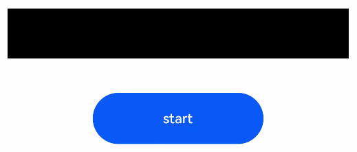
// xxx.ets
@Entry
@Component
struct MarqueeExample {
  @State start: boolean = false
  @State fromStart: boolean = true
  @State step: number = 50
  @State loop: number = 3
  @State src: string = "Running Marquee starts rolling"

  build() {
    Flex({ direction: FlexDirection.Column, alignItems: ItemAlign.Center, justifyContent: FlexAlign.Center }) {
      Marquee({
        start: this.start,
        step: this.step,
        loop: this.loop,
        fromStart: this.fromStart,
        src: this.src
      })
        .width(400)
        .fontColor(Color.White)
        .fontSize(50)
        .allowScale(false)
        .fontWeight(FontWeight.Bold)
        .backgroundColor(Color.Black)
        .margin({bottom:40})
        .onStart(() => {
          console.log('Marquee animation complete onStart')
        })
        .onBounce(() => {
          console.log('Marquee animation complete onBounce')
        })
        .onFinish(() => {
          console.log('Marquee animation complete onFinish')
        })
        Button('start')
          .onClick(() => {
            this.start = true
          })
          .width(200)
          .height(60)
          .margin({bottom:20})
    }
    .width('100%')
    .height('100%')
  }
}
1
2
3
4
5
6
7
8
9
10
11
12
13
14
15
16
17
18
19
20
21
22
23
24
25
26
27
28
29
30
31
32
33
34
35
36
37
38
39
40
41
42
43
44
45
46
47
2
3
4
5
6
7
8
9
10
11
12
13
14
15
16
17
18
19
20
21
22
23
24
25
26
27
28
29
30
31
32
33
34
35
36
37
38
39
40
41
42
43
44
45
46
47