# Checkbox
提供多选框组件,通常用于某选项的打开或关闭。
说明:
该组件从API Version 8开始支持。后续版本如有新增内容,则采用上角标单独标记该内容的起始版本。
# 权限列表
无
# 子组件
无
# 接口
Checkbox( options?: {name?: string, group?: string} )
参数:
| 参数名 | 参数类型 | 必填 | 默认值 | 参数描述 |
|---|---|---|---|---|
| name | string | 否 | - | 多选框名称。 |
| group | string | 否 | - | 多选框的群组名称。 |
# 属性
| 名称 | 参数类型 | 默认值 | 描述 |
|---|---|---|---|
| select | boolean | false | 设置多选框是否选中。 |
| selectedColor | ResourceColor | - | 设置多选框选中状态颜色。 |
# 事件
| 名称 | 功能描述 |
|---|---|
| onChange(callback: (value: boolean) => void) | 当选中状态发生变化时,触发该回调。 - value为true时,表示已选中。 - value为false时,表示未选中。 |
# 示例
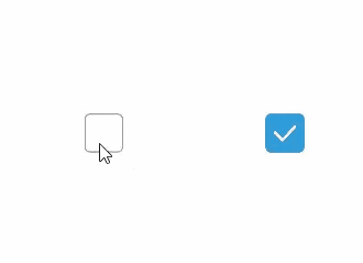
// xxx.ets
@Entry
@Component
struct CheckboxExample {

  build() {
    Row() {
      Checkbox({name: 'checkbox1',  group: 'checkboxGroup'})
        .select(true)
        .selectedColor(0xed6f21)
        .onChange((value: boolean) => {
          console.info('Checkbox1 change is'+ value)
        })
      Checkbox({name: 'checkbox2',  group: 'checkboxGroup'})
        .select(false)
        .selectedColor(0x39a2db)
        .onChange((value: boolean) => {
          console.info('Checkbox2 change is'+ value)
        })
    }
  }
}
1
2
3
4
5
6
7
8
9
10
11
12
13
14
15
16
17
18
19
20
21
22
2
3
4
5
6
7
8
9
10
11
12
13
14
15
16
17
18
19
20
21
22