# 开关
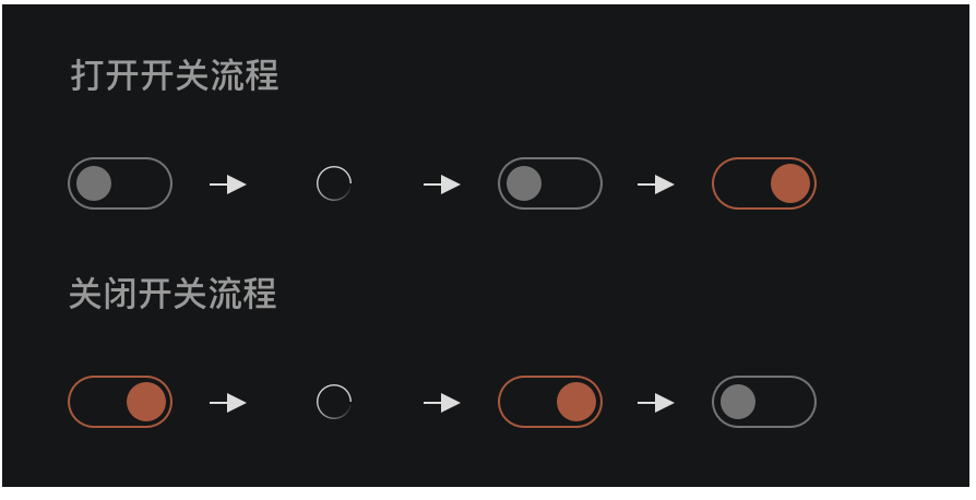
开关选择器。需要表示开关状态/两种状态之间的切换时使用。
使用规则
默认颜色:B35336
辅助色:FFFFFF40%
基本样式
大小:48 * 24 px
开关中加载样式
# 示例
<template>
  <div class="wrapper">
    <dof-minibar title="4.2开关"></dof-minibar>
    <scroller>
      <div class="title-box">
        <text class="title-text">开关基础组件</text>
      </div>
      <dof-cell title="开关" class="cell-item" :has-arrow="false" :isHighlight="false">
        <dof-switch slot="switch" :checked="val" @dof-change="val = !val"></dof-switch>
      </dof-cell>

      <dof-cell title="开关(关闭)" class="cell-item" :has-arrow="false" :isHighlight="false">
        <dof-switch slot="switch" :checked="val2" @dof-change="val2 = !val2"></dof-switch>
      </dof-cell>

      <dof-cell title="开关(禁用)" class="cell-item" :has-arrow="false" :isHighlight="false">
        <dof-switch slot="switch" :checked="val3" :disabled="true"></dof-switch>
      </dof-cell>
      <div class="title-box">
        <text class="title-text">开关中配置loading</text>
      </div>
      <dof-cell title="开关" class="cell-item" :has-arrow="false" :isHighlight="false">
        <dof-switch slot="switch" :checked="val" :loading="isLoading" @dof-change="handleChange"></dof-switch>
      </dof-cell>
    </scroller>
  </div>
</template>

<style scoped>
.wrapper {
  background-color: #f9f9f9;
}
.title-box {
  padding: 32px;
  background-color: #e5e5e8;
}
.title-text {
  font-family: PingFangSC-Medium;
  font-size: 36px;
  color: #000000;
  font-weight: 500;
}
.cell-item {
  margin-top: 16px;
  margin-bottom: 16px;
}

@media screen and (weex-theme: colmo) {
  .wrapper {
    background-color: #151617;
  }
}
</style>

<script>
import { DofMinibar, DofCell, DofSwitch } from 'dolphin-weex-ui'
export default {
  components: { DofMinibar, DofCell, DofSwitch },
  data: () => ({
    val: true,
    val2: false,
    val3: true,
    isLoading: false
  }),
  computed: {
    isColmo() {
      return this.$theme && this.$theme.getTheme() === 'colmo'
    },
    bgColor() {
      return this.isColmo ? '#151617' : '#fff'
    },
    textColor() {
      return this.isColmo ? 'rgba(255, 255, 255, 0.8)' : '#333'
    }
  },
  created() {},
  methods: {
    handleChange() {
      this.val = !this.val
      this.isLoading = true
      setTimeout(() => (this.isLoading = false), 500)
    }
  }
}
</script>
1
2
3
4
5
6
7
8
9
10
11
12
13
14
15
16
17
18
19
20
21
22
23
24
25
26
27
28
29
30
31
32
33
34
35
36
37
38
39
40
41
42
43
44
45
46
47
48
49
50
51
52
53
54
55
56
57
58
59
60
61
62
63
64
65
66
67
68
69
70
71
72
73
74
75
76
77
78
79
80
81
82
83
84
85
86
87
88
89
2
3
4
5
6
7
8
9
10
11
12
13
14
15
16
17
18
19
20
21
22
23
24
25
26
27
28
29
30
31
32
33
34
35
36
37
38
39
40
41
42
43
44
45
46
47
48
49
50
51
52
53
54
55
56
57
58
59
60
61
62
63
64
65
66
67
68
69
70
71
72
73
74
75
76
77
78
79
80
81
82
83
84
85
86
87
88
89
# Attributes
| Prop | Type | Required | Default | Description |
|---|---|---|---|---|
| checked | Boolean | N | true | 开关状态 |
| type | String | N | default | default/slate/aqua/turquoise/orange-red/orange/yellow/red/brown/colmo |
| disabled | Boolean | N | false | 是否禁用 |
| borderColor | String | N | `` | 自定义边框颜色 |
| backgroundColor | String | N | `` | 自定义背景颜色 |
| isScale | Boolean | N | true | 开关切换状态圆大小是否变化 |
| dotColor | String | N | `` | 自定义圆颜色 |
| loading | Boolean | N | false | 是否加载状态 |
| isLightLoading | Boolean | N | false | 加载图标是否为白色 |
| blindHelptext | String | N | 设置无障碍模式提示文本 |
# Events
| 事件名 | 说明 | 回调参数 |
|---|---|---|
dofChange | 开关改变时触发 | - |
点我扫二维码 查看demo