# 焦点事件
焦点事件指页面焦点在可获焦组件间移动时触发的事件,组件可使用焦点事件来处理相关逻辑。
说明:
从API Version 8开始支持。后续版本如有新增内容,则采用上角标单独标记该内容的起始版本。
目前仅支持通过外接键盘的tab键、方向键触发。
# 事件
| 名称 | 支持冒泡 | 功能描述 |
|---|---|---|
| onFocus(event: () => void) | 否 | 当前组件获取焦点时触发的回调。 |
| onBlur(event:() => void) | 否 | 当前组件失去焦点时触发的回调。 |
# 示例
// xxx.ets
@Entry
@Component
struct FocusEventExample {
@State oneButtonColor: string = '#FFC0CB';
@State twoButtonColor: string = '#87CEFA';
@State threeButtonColor: string = '#90EE90';
build() {
Column({ space: 20 }) {
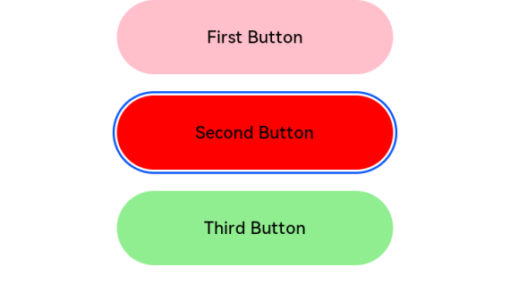
// 通过外接键盘的上下键可以让焦点在三个按钮间移动,按钮获焦时颜色变化,失焦时变回原背景色
Button('First Button')
.backgroundColor(this.oneButtonColor)
.width(260)
.height(70)
.fontColor(Color.Black)
.focusable(true)
.onFocus(() => {
this.oneButtonColor = '#FF0000';
})
.onBlur(() => {
this.oneButtonColor = '#FFC0CB';
})
Button('Second Button')
.backgroundColor(this.twoButtonColor)
.width(260)
.height(70)
.fontColor(Color.Black)
.focusable(true)
.onFocus(() => {
this.twoButtonColor = '#FF0000';
})
.onBlur(() => {
this.twoButtonColor = '#87CEFA';
})
Button('Third Button')
.backgroundColor(this.threeButtonColor)
.width(260)
.height(70)
.fontColor(Color.Black)
.focusable(true)
.onFocus(() => {
this.threeButtonColor = '#FF0000';
})
.onBlur(() => {
this.threeButtonColor = '#90EE90';
})
}.width('100%').margin({ top: 20 })
}
}
1
2
3
4
5
6
7
8
9
10
11
12
13
14
15
16
17
18
19
20
21
22
23
24
25
26
27
28
29
30
31
32
33
34
35
36
37
38
39
40
41
42
43
44
45
46
47
48
49
50
2
3
4
5
6
7
8
9
10
11
12
13
14
15
16
17
18
19
20
21
22
23
24
25
26
27
28
29
30
31
32
33
34
35
36
37
38
39
40
41
42
43
44
45
46
47
48
49
50