# Flex布局
说明:
- 从API Version 7开始支持。后续版本如有新增内容,则采用上角标单独标记该内容的起始版本。
- 仅当父组件是 Flex、Column、Row 时生效。
# 属性
| 名称 | 参数说明 | 描述 |
|---|---|---|
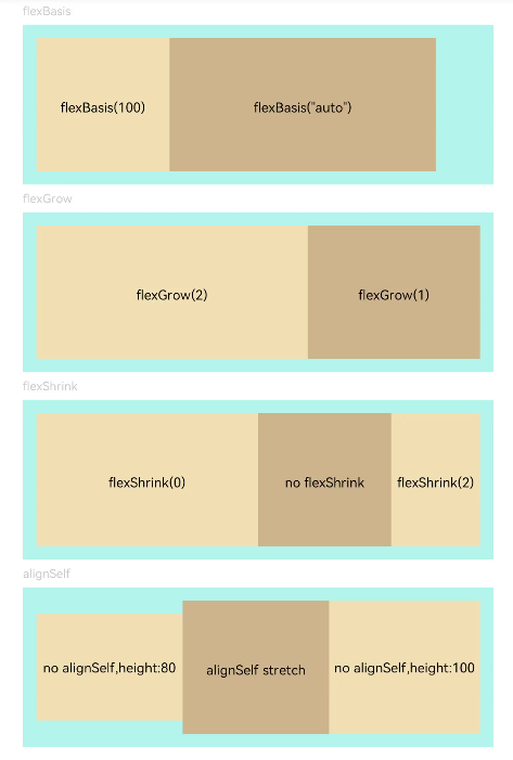
| flexBasis | string | number | 设置组件在父容器主轴方向上的基准尺寸。 默认值:'auto'(表示组件在主轴方向上的基准尺寸为组件原本的大小) |
| flexGrow | number | 设置父容器的剩余空间分配给此属性所在组件的比例。 默认值:0 |
| flexShrink | number | 设置父容器压缩尺寸分配给此属性所在组件的比例。 默认值:1 |
| alignSelf | ItemAlign | 子组件在父容器交叉轴的对齐格式,覆盖Flex布局容器中alignItems默认配置。 默认值:ItemAlign.Auto |
# 示例
// xxx.ets
@Entry
@Component
struct FlexExample {
  build() {
    Column({ space: 5 }) {
      Text('flexBasis').fontSize(9).fontColor(0xCCCCCC).width('90%')
      // 基于主轴基准尺寸
      // flexBasis()值可以是'auto',表示基准尺寸是元素本来的大小 ,也可以是长度设置,相当于.width()/.height()
      Flex() {
        Text('flexBasis(100)')
          .flexBasis('100')
          .height(100)
          .lineHeight(70)
          .backgroundColor(0xF5DEB3)
          .textAlign(TextAlign.Center)
        Text('flexBasis("auto")')
          .flexBasis('auto')
          .width('60%')
          .height(100)
          .lineHeight(70)
          .backgroundColor(0xD2B48C)
          .textAlign(TextAlign.Center)
      }.width('90%').height(120).padding(10).backgroundColor(0xAFEEEE)

      Text('flexGrow').fontSize(9).fontColor(0xCCCCCC).width('90%')
      // 剩余空间所占比例
      // flexGrow()剩余空间分配给该元素的比例
      Flex() {
        Text('flexGrow(2)')
          .flexGrow(2)
          .height(100)
          .lineHeight(70)
          .backgroundColor(0xF5DEB3)
          .textAlign(TextAlign.Center)
        Text('flexGrow(1)')
          .flexGrow(1)
          .height(100)
          .lineHeight(70)
          .backgroundColor(0xD2B48C)
          .textAlign(TextAlign.Center)
      }.width('90%').height(120).padding(10).backgroundColor(0xAFEEEE)

      Text('flexShrink').fontSize(9).fontColor(0xCCCCCC).width('90%')
      // flexShrink()此属性所在的组件的比例
      // text1比例是0,其他都是默认值1,放不下时直接等比例缩放后两个,第一个不缩放
      Flex({ direction: FlexDirection.Row }) {
        Text('flexShrink(0)')
          .flexShrink(0)
          .width('50%')
          .height(100)
          .lineHeight(70)
          .backgroundColor(0xF5DEB3)
          .textAlign(TextAlign.Center)
        Text('no flexShrink')
          .width('40%')
          .height(100)
          .lineHeight(70)
          .backgroundColor(0xD2B48C)
          .textAlign(TextAlign.Center)
        Text('flexShrink(2)')
          .flexShrink(2)
          .width('40%')
          .height(100)
          .lineHeight(70)
          .backgroundColor(0xF5DEB3)
          .textAlign(TextAlign.Center)
      }.width('90%').height(120).padding(10).backgroundColor(0xAFEEEE)

      Text('alignSelf').fontSize(9).fontColor(0xCCCCCC).width('90%')
      // alignSelf()覆盖Flex布局容器中alignItems默认配置
      Flex({ direction: FlexDirection.Row, alignItems: ItemAlign.Center }) {
        Text('no alignSelf,height:80').width('33%').height(80)
          .backgroundColor(0xF5DEB3).textAlign(TextAlign.Center)
        Text('alignSelf stretch')
          .alignSelf(ItemAlign.Stretch)
          .width('33%')
          .height(80)
          .lineHeight(70)
          .backgroundColor(0xD2B48C)
          .textAlign(TextAlign.Center)
        Text('no alignSelf,height:100').width('34%').height(100)
          .backgroundColor(0xF5DEB3).textAlign(TextAlign.Center)
      }.width('90%').height(120).padding(10).backgroundColor(0xAFEEEE)
    }.width('100%').margin({ top: 5 })
  }
}
1
2
3
4
5
6
7
8
9
10
11
12
13
14
15
16
17
18
19
20
21
22
23
24
25
26
27
28
29
30
31
32
33
34
35
36
37
38
39
40
41
42
43
44
45
46
47
48
49
50
51
52
53
54
55
56
57
58
59
60
61
62
63
64
65
66
67
68
69
70
71
72
73
74
75
76
77
78
79
80
81
82
83
84
85
86
87
2
3
4
5
6
7
8
9
10
11
12
13
14
15
16
17
18
19
20
21
22
23
24
25
26
27
28
29
30
31
32
33
34
35
36
37
38
39
40
41
42
43
44
45
46
47
48
49
50
51
52
53
54
55
56
57
58
59
60
61
62
63
64
65
66
67
68
69
70
71
72
73
74
75
76
77
78
79
80
81
82
83
84
85
86
87