MiniX自绘渲染跨平台框架
  • 框架说明
  • 声明式开发范式
  • 内置Api
指南
接口
  • Minix CLI
示例
  • 类Web框架

    • 框架说明
    • 类Web开发范式
    • 内置Api
  • 指南
  • 组件
  • 接口
  • 示例
  • 规范
  • DophinHybrid

    • 快速上手 (opens new window)
    • UI 组件库 (opens new window)
    • jsBridge 接口 (opens new window)
  • DolphinWeex

    • 快速上手 (opens new window)
    • UI 组件库 (opens new window)
    • jsBridge 接口 (opens new window)
  • 发布消息
  • 常见问题
  • 更新日志
  • 组件通用信息

  • 基础组件

  • 容器组件

    • AlphabetIndexer
    • Badge
    • Column
    • ColumnSplit
    • Counter
    • Flex
    • GridContainer
    • Grid
    • GridItem
    • List
    • ListItem
    • Navigator
    • Panel
    • Refresh
    • Row
    • RowSplit
    • Scroll
    • SideBarContainer
    • Stack
      • 子组件
      • 接口
      • 示例
    • Swiper
    • Tabs
    • TabContent
  • 媒体组件

  • 绘制组件

  • 画布组件

  • 动画

  • 全局 UI 方法

  • 文档中涉及到的内置枚举值
  • 类型定义

# Stack

堆叠容器,子组件按照顺序依次入栈,后一个子组件覆盖前一个子组件。

说明:

该组件从API Version 7开始支持。后续版本如有新增内容,则采用上角标单独标记该内容的起始版本。

# 子组件

可以包含子组件。

# 接口

Stack(value?: {alignContent?: Alignment})

参数:

参数名 参数类型 必填 参数描述
alignContent Alignment 否 设置子组件在容器内的对齐方式。
默认值:Alignment.Center

# 示例

// xxx.ets
@Entry
@Component
struct StackExample {
  build() {
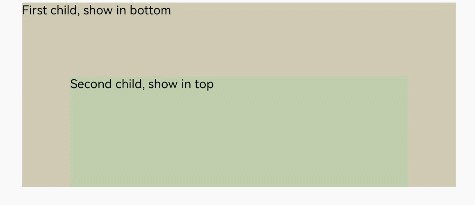
    Stack({ alignContent: Alignment.Bottom }) {
      Text('First child, show in bottom').width('90%').height('100%').backgroundColor(0xd2cab3).align(Alignment.Top)
      Text('Second child, show in top').width('70%').height('60%').backgroundColor(0xc1cbac).align(Alignment.Top)
    }.width('100%').height(150).margin({ top: 5 })
  }
}
1
2
3
4
5
6
7
8
9
10
11

zh-cn_image_0000001219982699