# Badge
可以附加在单个组件上用于信息标记的容器组件。
说明: 该组件从API Version 7开始支持。后续版本如有新增内容,则采用上角标单独标记该内容的起始版本。
# 子组件
支持单个子组件。
# 接口
方法1: Badge(value: {count: number, position?: BadgePosition, maxCount?: number, style: BadgeStyle})
创建数字标记组件。
参数:
| 参数名 | 参数类型 | 必填 | 默认值 | 参数描述 |
|---|---|---|---|---|
| count | number | 是 | - | 设置提醒消息数。 |
| position | BadgePosition | 否 | BadgePosition.RightTop | 设置提示点显示位置。 |
| maxCount | number | 否 | 99 | 最大消息数,超过最大消息时仅显示maxCount+。 |
| style | BadgeStyle | 是 | - | Badge组件可设置样式,支持设置文本颜色、尺寸、圆点颜色和尺寸。 |
方法2: Badge(value: {value: string, position?: BadgePosition, style: BadgeStyle})
根据字符串创建标记组件。
参数:
| 参数名 | 参数类型 | 必填 | 默认值 | 参数描述 |
|---|---|---|---|---|
| value | string | 是 | - | 提示内容的文本字符串。 |
| position | BadgePosition | 否 | BadgePosition.RightTop | 设置提示点显示位置。 |
| style | BadgeStyle | 是 | - | Badge组件可设置样式,支持设置文本颜色、尺寸、圆点颜色和尺寸。 |
# BadgePosition枚举说明
| 名称 | 描述 |
|---|---|
| RightTop | 圆点显示在右上角。 |
| Right | 圆点显示在右侧纵向居中。 |
| Left | 圆点显示在左侧纵向居中。 |
# BadgeStyle对象说明
| 名称 | 类型 | 必填 | 默认值 | 描述 |
|---|---|---|---|---|
| color | ResourceColor | 否 | Color.White | 文本颜色。 |
| fontSize | number | string | 否 | 10 | 文本大小,单位vp。 |
| badgeSize | number | string | 否 | 16 | Badge的大小,单位vp。不支持百分比形式设置。 |
| badgeColor | ResourceColor | 否 | Color.Red | Badge的颜色。 |
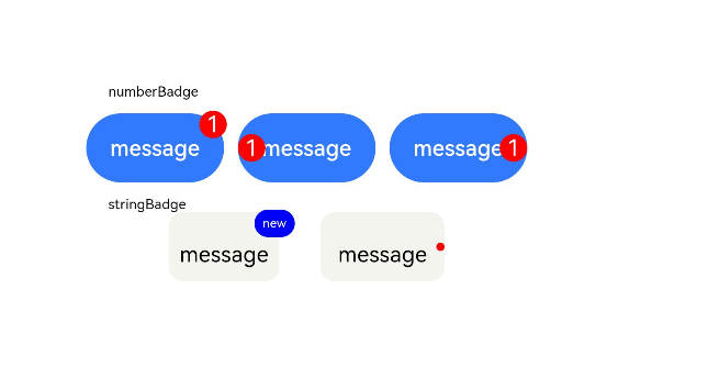
# 示例
// xxx.ets
@Entry
@Component
struct BadgeExample {
  @State counts: number = 1;
  @State message: string = 'new';

  build() {
    Column() {
      Text('numberBadge').width('80%')
      Row({ space: 10 }) {
        // 数字上标,maxCount默认99,超过99展示99+
        Badge({
          count: this.counts,
          maxCount: 99,
          position: BadgePosition.RightTop,
          style: { color: 0xFFFFFF, fontSize: 16, badgeSize: 20, badgeColor: Color.Red }
        }) {
          Button('message')
            .onClick(() => {
              this.counts++;
            })
            .width(100).height(50).backgroundColor(0x317aff)
        }.width(100).height(50)

        // 数字上标
        Badge({
          count: this.counts,
          maxCount: 99,
          position: BadgePosition.Left,
          style: { color: 0xFFFFFF, fontSize: 16, badgeSize: 20, badgeColor: Color.Red }
        }) {
          Button('message')
            .onClick(() => {
              this.counts++;
            })
            .width(100).height(50).backgroundColor(0x317aff)
        }.width(100).height(50)


        // 数字上标
        Badge({
          count: this.counts,
          maxCount: 99,
          position: BadgePosition.Right,
          style: { color: 0xFFFFFF, fontSize: 16, badgeSize: 20, badgeColor: Color.Red }
        }) {
          Button('message')
            .onClick(() => {
              this.counts++;
            })
            .width(100).height(50).backgroundColor(0x317aff)
        }.width(100).height(50)
      }.margin(10)

      Text('stringBadge').width('80%')
      Row({ space: 30 }) {
        Badge({
          value: this.message,
          style: { color: 0xFFFFFF, fontSize: 9, badgeSize: 20, badgeColor: Color.Blue }
        }) {
          Text('message')
            .width(80)
            .height(50)
            .fontSize(16)
            .lineHeight(37)
            .borderRadius(10)
            .textAlign(TextAlign.Center)
            .backgroundColor(0xF3F4ED)
        }.width(80).height(50)

        // value为空,设置圆点标记
        Badge({
          value: '',
          position: BadgePosition.Right,
          style: { badgeSize: 6, badgeColor: Color.Red }
        }) {
          Text('message')
            .width(90)
            .height(50)
            .fontSize(16)
            .lineHeight(37)
            .borderRadius(10)
            .textAlign(TextAlign.Center)
            .backgroundColor(0xF3F4ED)
        }.width(90).height(50)
      }.margin(10)
    }
  }
}
1
2
3
4
5
6
7
8
9
10
11
12
13
14
15
16
17
18
19
20
21
22
23
24
25
26
27
28
29
30
31
32
33
34
35
36
37
38
39
40
41
42
43
44
45
46
47
48
49
50
51
52
53
54
55
56
57
58
59
60
61
62
63
64
65
66
67
68
69
70
71
72
73
74
75
76
77
78
79
80
81
82
83
84
85
86
87
88
89
90
2
3
4
5
6
7
8
9
10
11
12
13
14
15
16
17
18
19
20
21
22
23
24
25
26
27
28
29
30
31
32
33
34
35
36
37
38
39
40
41
42
43
44
45
46
47
48
49
50
51
52
53
54
55
56
57
58
59
60
61
62
63
64
65
66
67
68
69
70
71
72
73
74
75
76
77
78
79
80
81
82
83
84
85
86
87
88
89
90