# 开关
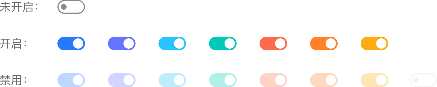
开关选择器。需要表示开关状态/两种状态之间的切换时使用。
# 颜色使用规则
蓝色:默认颜色,用于美居全局,插件页更多等表单页面
辅助色:插件页整体用辅助色情况,开关颜色跟随插件页主页变化
# 基本样式
大小:48 * 24 px
点我扫二维码,查看demo
# Switch 开关
# 介绍
用于在打开和关闭状态之间进行切换。
# 引入
通过一下方式来全局注册组件。更多注册方式敬请期待。
import Vue from 'vue';
import { Switch } from '@dolphin-iot/ui';

Vue.use(Switch);
1
2
3
4
2
3
4
# 代码演示
# 基础用法
通过 v-model 绑定开关的选中状态,true 表示开,false 表示关。
<template>
  <mx-switch v-model="value" />
</template>
<script>
export default {
  data(){
    return {
      value:false
    }
  }
}
</script>
1
2
3
4
5
6
7
8
9
10
11
12
2
3
4
5
6
7
8
9
10
11
12
# 开关主题
通过 theme 参数控制开关的主题颜色,开关支持 brand purple blue-purple blue cyan yellow orange orange-red gray-offline 九种主题颜色,默认为美的品牌色 brand。
<mx-switch theme="purple" />
<mx-switch theme="blue-purple" />
<mx-switch theme="blue" />
<mx-switch theme="cyan" />
<mx-switch theme="yellow" />
<mx-switch theme="orange" />
<mx-switch theme="orange-red" />
<mx-switch theme="gray-offline" />
1
2
3
4
5
6
7
8
2
3
4
5
6
7
8
# 自定义开关颜色
通过 color 参数可以自定义开关的主题颜色,color 参数支持 rgb rgba hsl hsla hwb 十六进制六种格式表达的颜色,当同时指定 theme color 时,color 的优先级更高。
<mx-switch color="#00cbb8" />
<mx-swtich color="rgba(248,248,248,1)" />
1
2
2
# 开关禁用
通过 disabled 参数可以控制开关是否为禁用状态,默认为 false,禁用状态下不会触发开关的事件,以及点击效果。
<mx-switch :disabled="true" />
1
# Api
# Props
| 参数 | 说明 | 类型 | 默认值 | 是否必须 |
|---|---|---|---|---|
| value | 开关的当前状态,支持v-model | boolean | false | 是 |
| theme | 主题色,可选值为:brand purple blue-purple blue cyan yellow orange orange-red gray-offline | string | brand | - |
| disabled | 是否禁用 | boolean | false | - |
| color | 自定义颜色,支持rgb rgba hsl hsla hwb 以及十六进制(#fff) | string | - | - |
# Events
| 事件名称 | 说明 | 回调参数 |
|---|---|---|
| change | 开的值发生变化时触发 | value: Boolean |