# 按钮
指导用户采取你希望他们采取的行动。
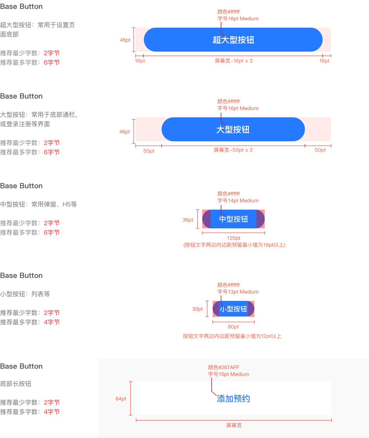
# 按钮尺寸
新版规范中按钮将使用圆角设计,提供四种为常用的尺寸大小参考,特殊情况下可按具体实际场景进行宽度定义。
# 按钮状态
按钮样式分为正常、点击、禁用状态三种:
默认状态:按钮处于可点击时的状态
点击状态:按钮点击时的反馈状态(所有点击状态底色均为正常效果下叠加黑色10%)
禁用状态:当条件不足时,点击无反馈,不执行任何指令
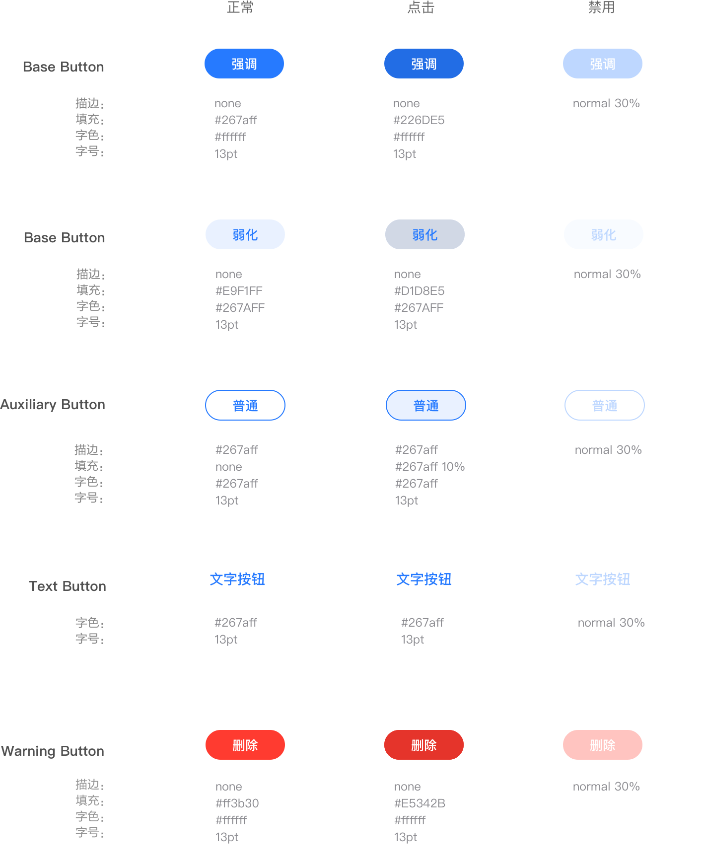
# 按钮颜色(用与插件页其他辅助色时)
颜色样式参照上方颜色状态,如遇到插件页特殊使用场景时,按钮根据需要可使用插件页本身主色,如下方规范辅助色
# 应用示例
# 超大型按钮
# 大型按钮
# 中型按钮
# 小型按钮
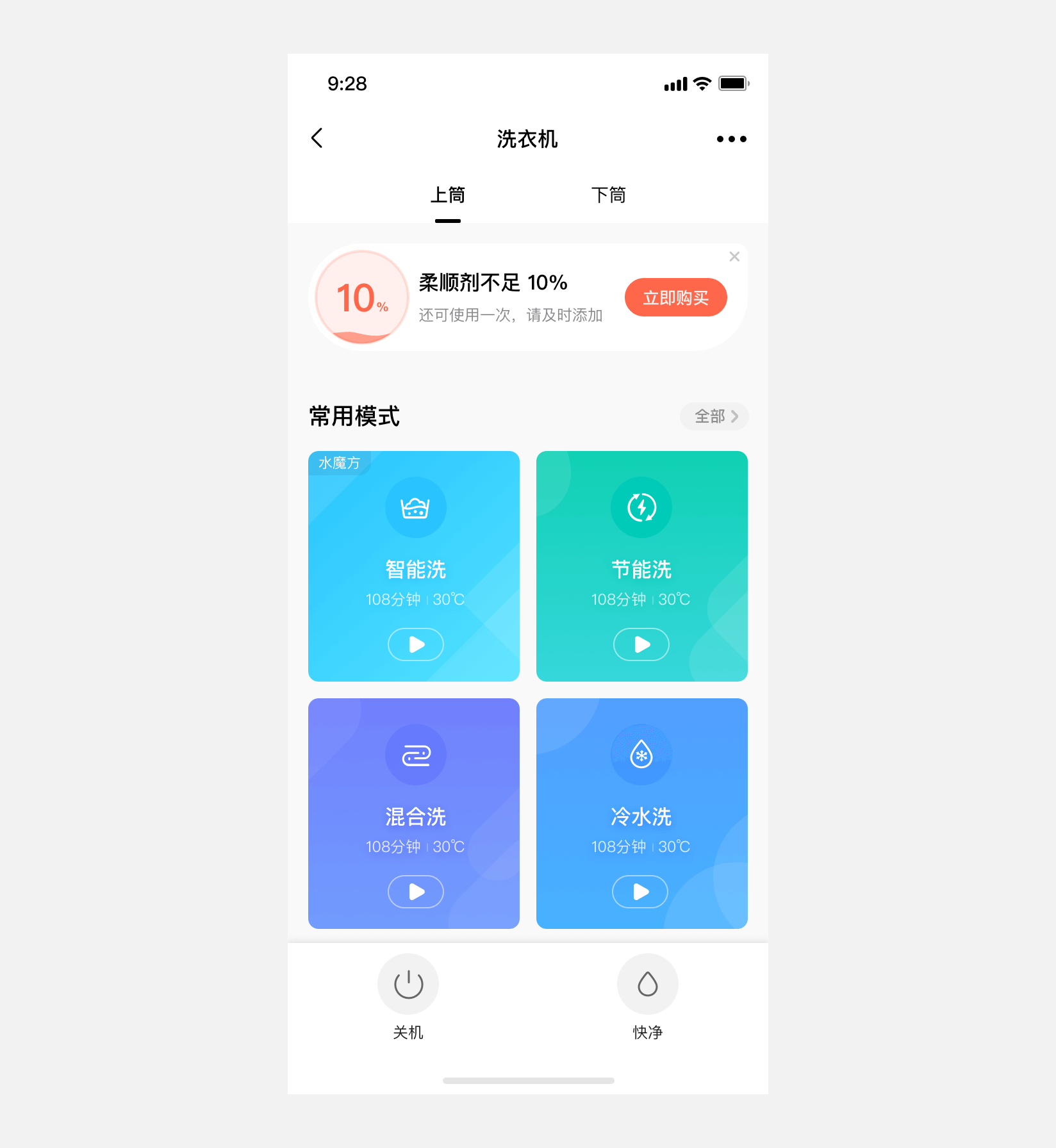
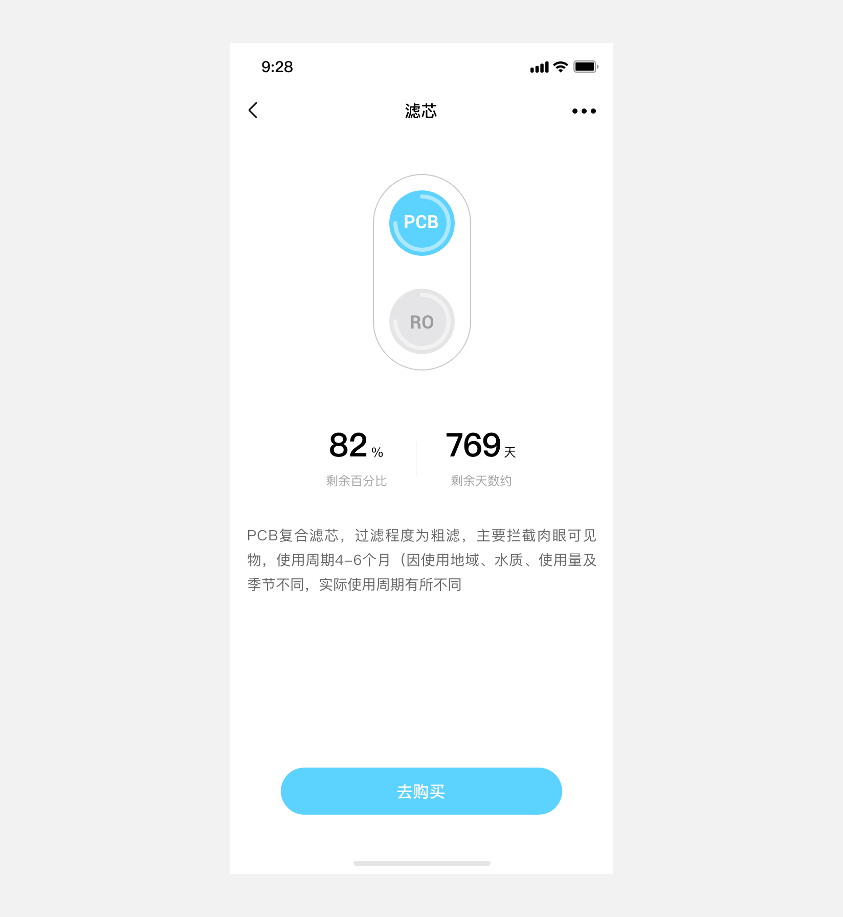
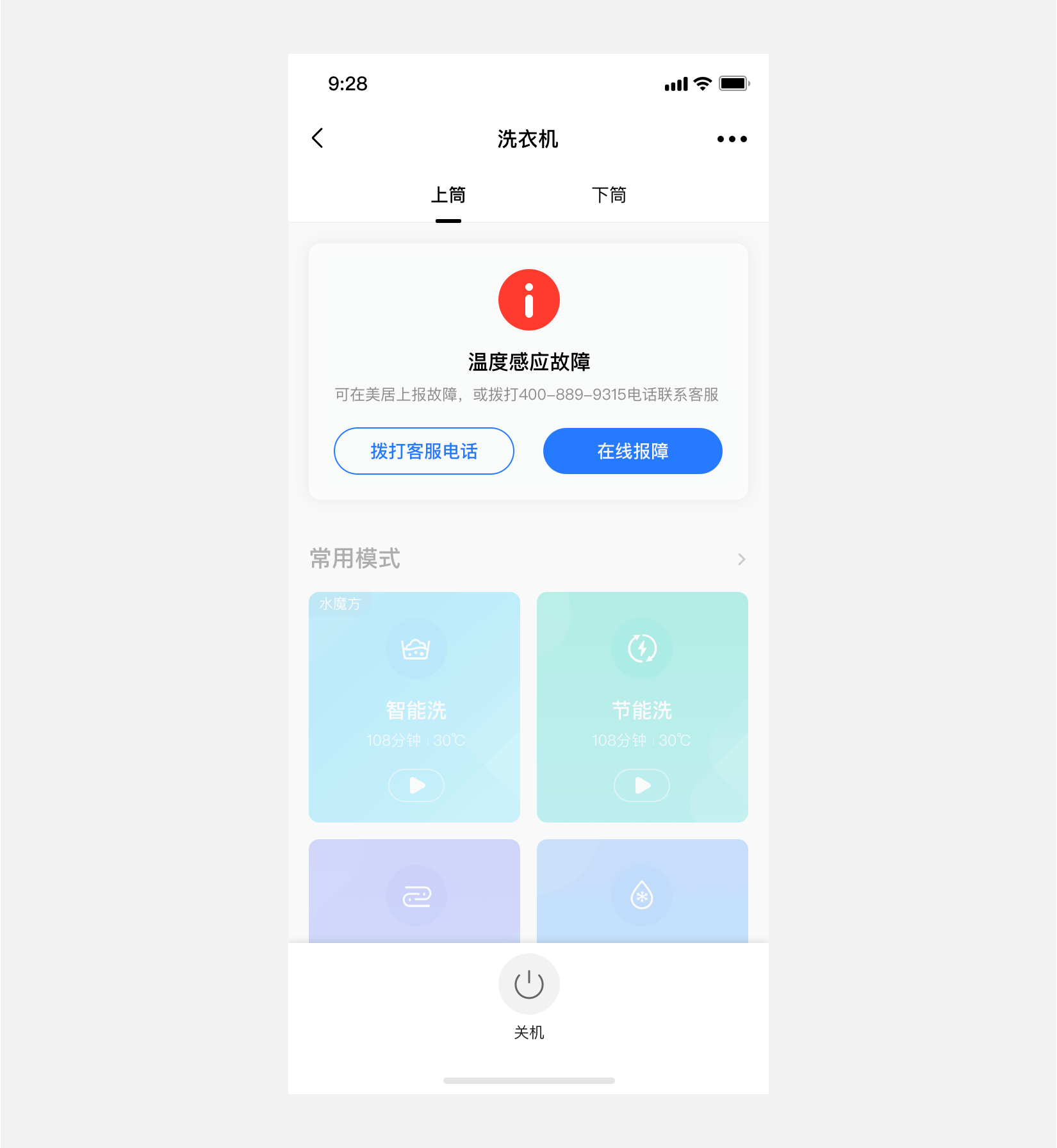
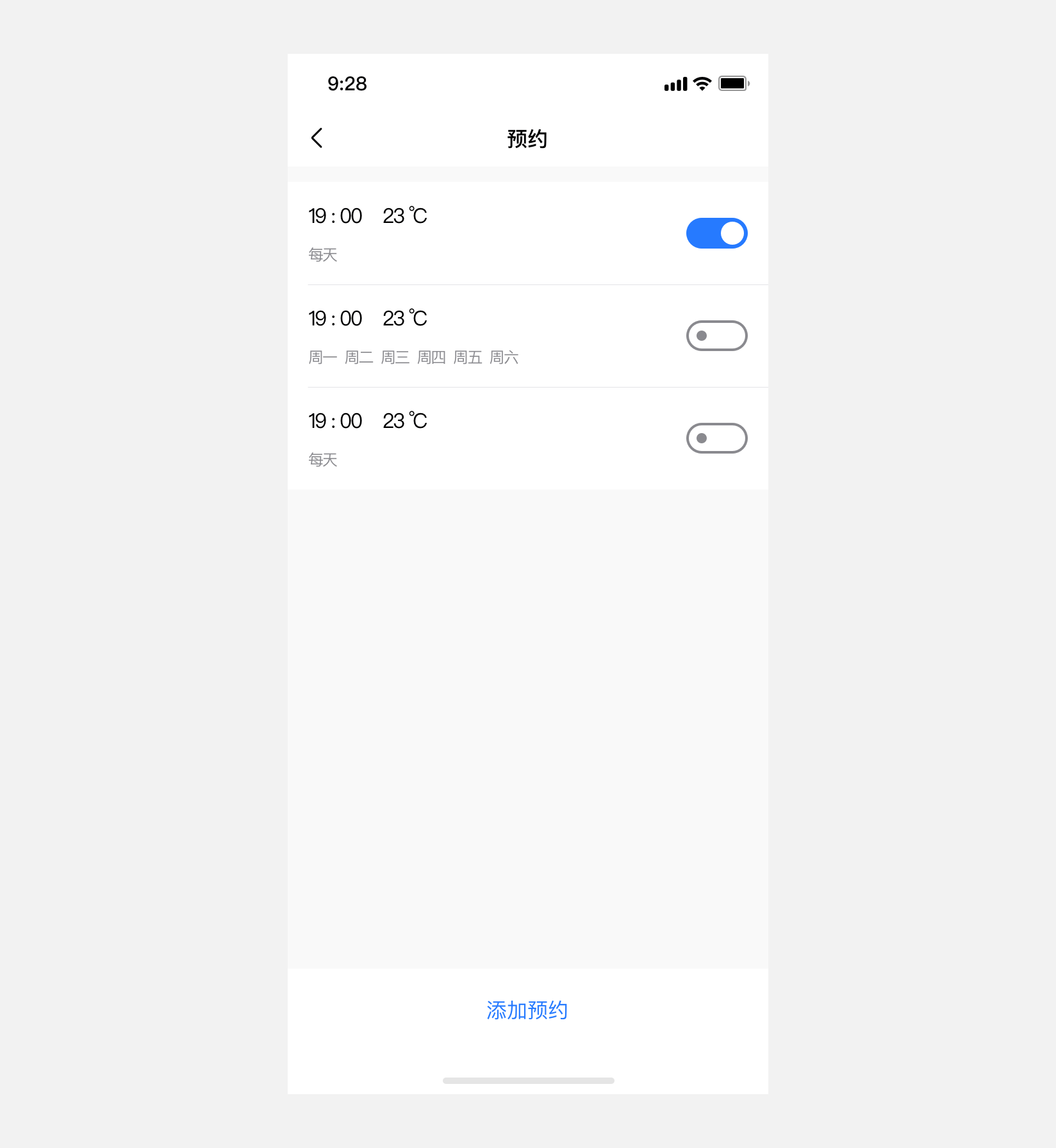
# 底部长按钮(文字按钮)
# Button 按钮
# 介绍
按钮用于触发一个操作,如表单提交。
# 引入
通过以下方式来全局注册组件。更多注册方式敬请期待。
import Vue from  'vue';
import { Button } from '@dolphin-iot/ui';

Vue.use(Button);
2
3
4
# 代码演示
# 按钮尺寸
通过 size 参数可以控制按钮的尺寸,按钮支持small middle large super 四种尺寸,默认为middle。其中 large 和 super 大小的按钮为块级元素,其大小为相对父级元素两边的固定像素单位。
<mx-button size="small">小型按钮</mx-button>
<mx-button>中型按钮</mx-button>
<mx-button size="large">大型按钮</mx-button>
<mx-button size="super">超大型按钮</mx-button>
2
3
4
# 按钮类型
通过 type 参数可以控制按钮的类型,按钮支持fill weak plain text 四种类型,默认为fill。
<mx-button>强调按钮</mx-button>
<mx-button type="weak">弱化按钮</mx-button>
<mx-button type="plain">普通按钮</mx-button>
<mx-button type="text">文本按钮</mx-button>
2
3
4
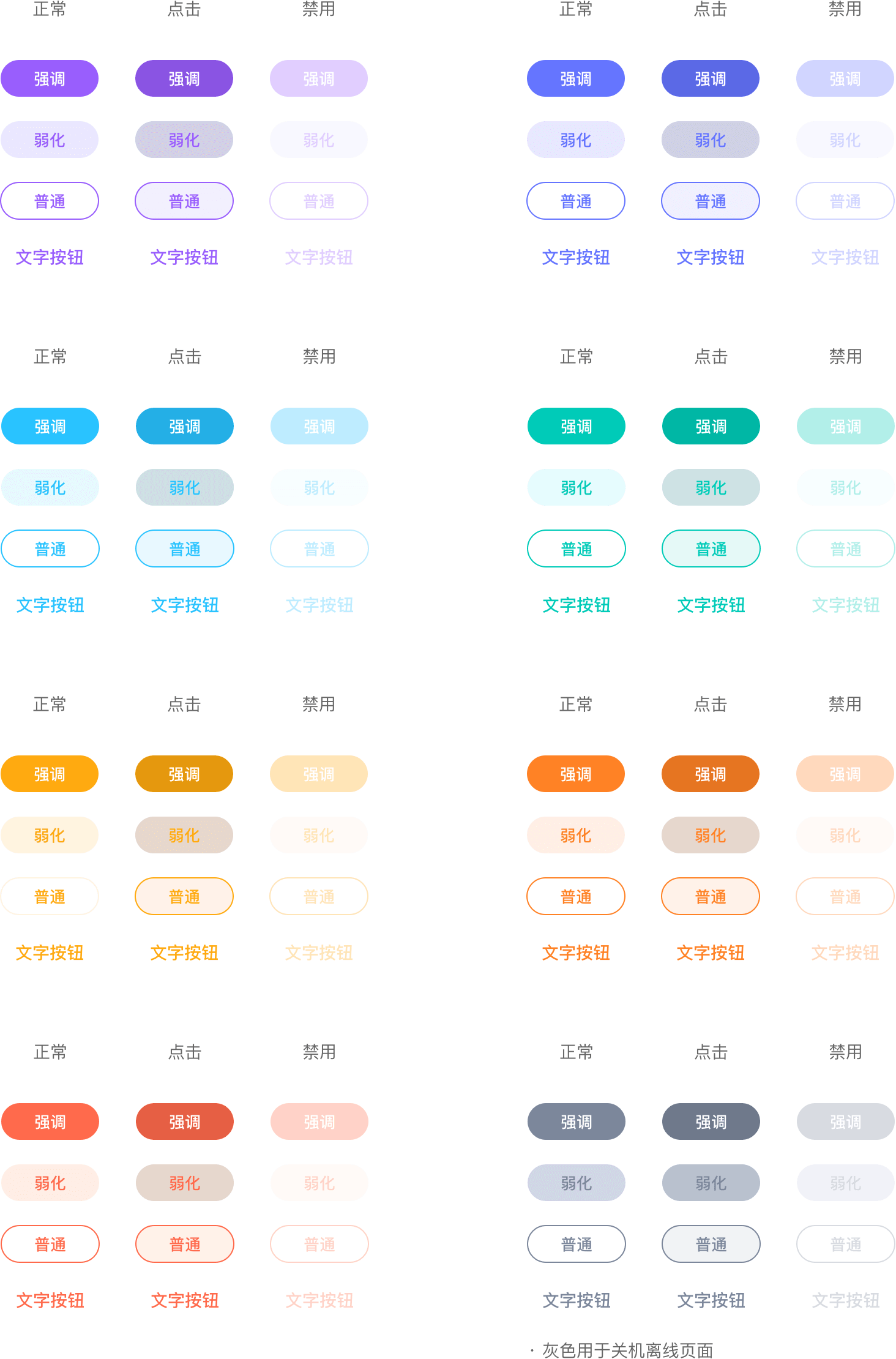
# 按钮主题色
通过 theme 参数可以控制按钮的主题颜色,按钮支持 brand purple blue-purple blue cyan yellow orange orange-red gray-offline 九种主题颜色,默认为美的品牌色 brand。
<mx-button>品牌色</mx-button>
<mx-button theme="purple">紫色</mx-button>
<mx-button theme="blue-purple">蓝紫色</mx-button>
<mx-button theme="blue">蓝色</mx-button>
<mx-button theme="cyan">青色</mx-button>
<mx-button theme="yellow">黄色</mx-button>
<mx-button theme="orange">橘黄色</mx-button>
<mx-button theme="orange-red">橘红色</mx-button>
<mx-button theme="gray-offline">离线灰色</mx-button>
2
3
4
5
6
7
8
9
10
# 自定义按钮颜色
通过 color 参数可以自定义按钮的主题颜色,color 参数仅支持 十六进制格式表达的颜色,当同时指定 theme color 时,color 的优先级更高。
<mx-button color="#25cf42">强调按钮</mx-button>
<mx-button type="weak" color="#25cf42">弱化按钮</mx-button>
<mx-button type="plain" color="#25cf42">普通按钮</mx-button>
<mx-button type="text" color="#25cf42">文本按钮</mx-button>
2
3
4
# 自定义按钮图标
通过 icon 参数可以控制按钮左侧加载的图标;icon-position属性参数控制图标所处的位置。通过 disabled 参数可以控制按钮是否为禁用状态,默认为 false,禁用状态下不会触发按钮的事件,以及点击效果。
<mx-button icon="star">强调</mx-button>
<mx-button icon="star" disabled>强调</mx-button>
<mx-button icon="search" theme="cyan">强调</mx-button>
<mx-button icon="search" theme="cyan" disabled>强调</mx-button>
<mx-button icon="close" color="#00cbb8" type="weak">弱化</mx-button>
<mx-button icon="close" color="#00cbb8" type="weak" :disabled="true">弱化</mx-button>
<mx-button icon="star-line" color="#ff8225" icon-position="right" type="plain">强调</mx-button>
<mx-button icon="star-line" color="#ff8225" icon-position="right" type="plain" :disabled="true">强调</mx-button>
2
3
4
5
6
7
8
# 按钮加载,有文字
通过 loading 参数可以控制按钮是否为加载状态,默认为 false,加载状态下不会触发按钮的事件,以及点击效果。
<mx-button :loading="true" theme="cyan">强调</mx-button>
<mx-button :loading="true" theme="cyan" :disabled="true">强调</mx-button>
<mx-button :loading="true" theme="purple">强调</mx-button>
<mx-button :loading="true" theme="purple" :disabled="true">强调</mx-button>
<mx-button :loading="true" color="#00cbb8" type="plain">强调</mx-button>
<mx-button :loading="true" color="#00cbb8" type="plain" disabled="true">强调</mx-button>
2
3
4
5
6
# 按钮加载,无文字
<mx-button :loading="true"></mx-button>
<mx-button :loading="true" disabled></mx-button>
<mx-button :loading="true" theme="cyan"></mx-button>
<mx-button :loading="true" theme="cyan" disabled></mx-button>
2
3
4
# 按钮形状
通过 round 参数可以控制按钮的形状,round 为 true时按钮形状为椭圆形,为 false 为矩形,默认为 true。
<mx-button round :loading="true">圆形按钮</mx-button>
<mx-button round :loading="true" :disabled="true">圆形按钮</mx-button>
<mx-button :round="false" :loading="true" theme="cyan">方形按钮</mx-button>
<mx-button :round="false" :loading="true" theme="cyan" :disabled="true">方形按钮</mx-button>
2
3
4
# API
# Props
| 参数 | 说明 | 类型 | 默认值 | 是否必须 |
|---|---|---|---|---|
| size | 按钮大小,可选值为: small middle large super | string | middle | |
| color | 自定义颜色,包含文字与图片颜色,仅支持十六进制格式表示的颜色 | string | - | |
| icon | 图标名称 | string | - | |
| type | 按钮背景状态,可选值为: fill weak plain text | string | fill | |
| theme | 按钮主题色,可选值为:brand loading-gray purple`` blue-purple blue cyan yellow orange orange-red gray-offline | string | brand | |
| icon-prefix | 图标前缀名称 | string | - | |
| icon-position | 图标所处位置,可选值为:left right | string | left | |
| loading | 是否显示图标加载状态 | boolean | false | |
| round | 按钮是否为圆形 | boolean | true | |
| disabled | 是否禁用按钮 | boolean | false | |
| loading-type | 加载状态下的图标类型,可选值为:spinner circular | string | spinner |
# Events
| 事件名称 | 说明 | 回调参数 |
|---|---|---|
| click | 点击按钮,且按钮状态不为加载或禁用时触发 | event: Event |
# Slots
| 名称 | 说明 |
|---|---|
| default | 按钮内容 |
# 样式变量
组件提供了下列 SCSS 变量,可用于自定义样式,使用方法请参考主题定制。