使用说明
# 套件效果图示
耗材不同数量时显示效果
耗材数量多于4个时滑动显示效果
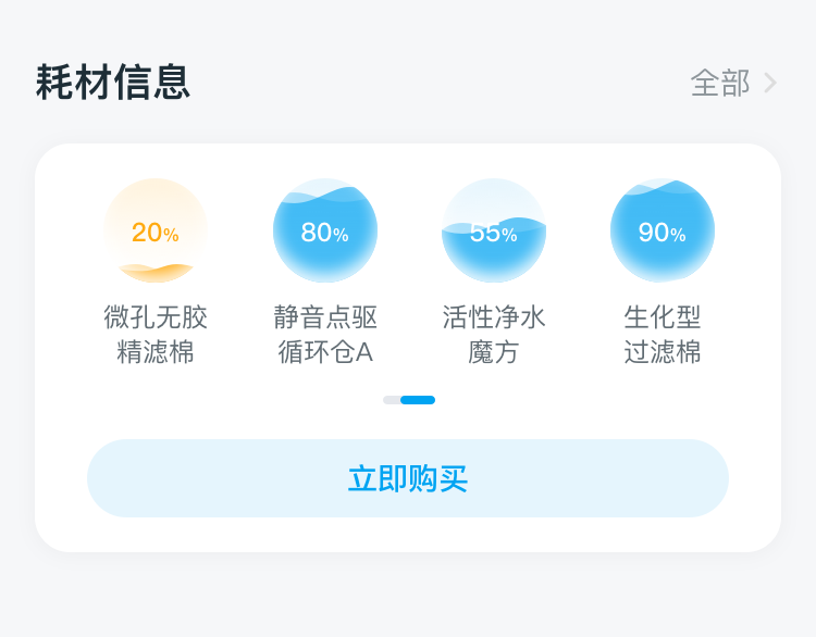
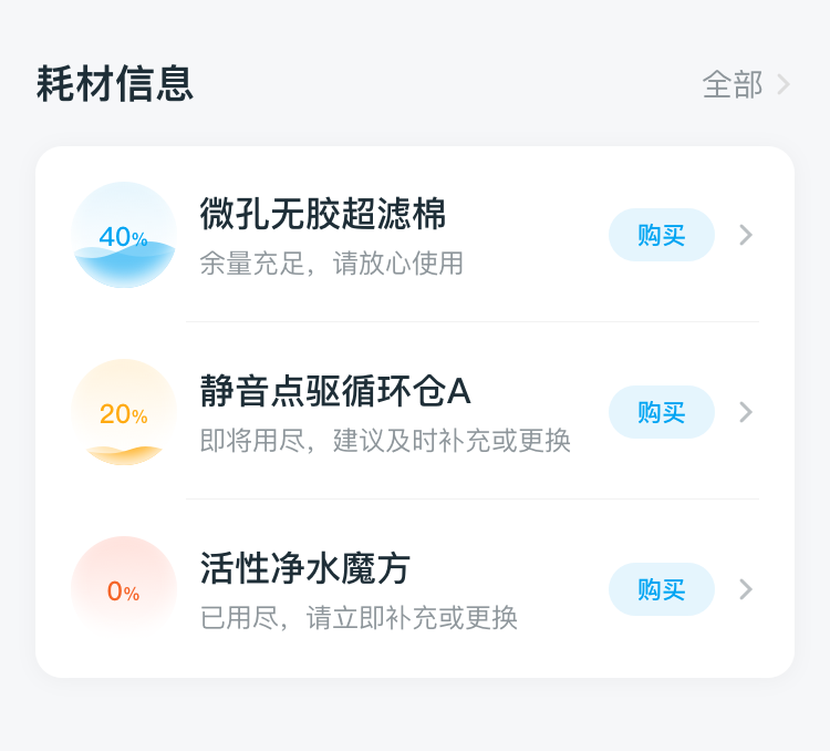
纵列超过2个以上耗材展示效果
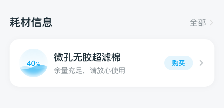
纵列1个耗材展示效果
# 套件调用示例
- 示例代码:
<template>
  <div class="app-wrapper">
    <DofBcConsumables layoutMode="row" deviceId="177021372139629"></DofBcConsumables>
    <DofBcConsumables deviceId="177021372139629" columnBoxHeight="1200"></DofBcConsumables>
  </div>
</template>
<script>
export default {
  components: {
    DofBcConsumables
  },
  data:()=> ({})
}
</script>
<style scoped>
.app-wrapper {
  flex: 1;
  background-color: #f9f9f9;
}
.font_style {
  font-family: FZLTHJW--GB1-0;
  font-size: 14px;
  color: #333333;
  line-height: 38px;
}
</style>
1
2
3
4
5
6
7
8
9
10
11
12
13
14
15
16
17
18
19
20
21
22
23
24
25
26
2
3
4
5
6
7
8
9
10
11
12
13
14
15
16
17
18
19
20
21
22
23
24
25
26
# 属性(data)
| Prop | Type | Required | Default | Description |
|---|---|---|---|---|
layoutMode | String | N | column | 耗材布局模式,默认纵列展示,支持行展示:row |
showMode | String | N | progress | 耗材展示模式,默认progress进度条展示,支持波浪展示:wave |
deviceId | String | Y | '' | 设备id |
columnBoxHeight | Number | N | 1200 | 只有在纵列展示时生效,支持自定义高度 |
showAddCartButton | Boolean | N | false | 行展示时是否显示立即购买按钮,纵列展示时无效 |