# swiper
说明: 从API version 4开始支持。后续版本如有新增内容,则采用上角标单独标记该内容的起始版本。
滑动容器,提供切换子组件显示的能力。
# 权限列表
无
# 子组件
支持除<list>之外的子组件。
# 属性
除支持通用属性外,还支持如下属性:
| 名称 | 类型 | 默认值 | 必填 | 描述 |
|---|---|---|---|---|
| index | number | 0 | 否 | 当前在容器中显示的子组件的索引值。 |
| autoplay | boolean | false | 否 | 子组件是否自动播放,自动播放状态下,导航点不可操作5+。 |
| interval | number | 3000 | 否 | 使用自动播放时播放的时间间隔,单位为ms。 |
| indicator | boolean | true | 否 | 是否启用导航点指示器,默认true。 |
| digital5+ | boolean | false | 否 | 是否启用数字导航点,默认为false。 必须设置indicator时才能生效数字导航点。 |
| indicatordisabled5+ | boolean | false | 否 | 指示器是否禁止用户手势操作,设置为true时,指示器不会响应用户的点击拖拽。 |
| loop | boolean | true | 否 | 是否开启循环滑动。 |
| duration | number | - | 否 | 子组件切换的动画时长。 |
| vertical | boolean | false | 否 | 是否为纵向滑动,纵向滑动时采用纵向的指示器。 |
| cachedsize7+ | number | -1 | 否 | swiper延迟加载时item最少缓存数量。-1表示全部缓存。 |
| scrolleffect7+ | string | spring | 否 | 滑动效果。目前支持如下: - spring:弹性物理动效,滑动到边缘后可以根据初始速度或通过触摸事件继续滑动一段距离,松手后回弹。 - fade:渐隐物理动效,滑动到边缘后展示一个波浪形的渐隐,根据速度和滑动距离的变化渐隐也会发送一定的变化 - none:滑动到边缘后无效果。 该属性仅在loop属性为false时生效。 |
# 样式
除支持通用样式外,还支持如下样式:
| 名称 | 类型 | 默认值 | 必填 | 描述 |
|---|---|---|---|---|
| indicator-color | <color> | - | 否 | 导航点指示器的填充颜色。 |
| indicator-selected-color | <color> | #ff007dff | 否 | 导航点指示器选中的颜色。 |
| indicator-size | <length> | 4px | 否 | 导航点指示器的直径大小。 |
| indicator-top|left|right|bottom | <length> | <percentage> | - | 否 | 导航点指示器在swiper中的相对位置。 |
| next-margin7+ | <length> | <percentage> | - | 否 | 后边距,用于露出后一项的一小部分。 |
| previous-margin7+ | <length> | <percentage> | - | 否 | 前边距,用于露出前一项的一小部分。 |
# 事件
除支持通用事件外,还支持如下事件:
| 名称 | 参数 | 描述 |
|---|---|---|
| change | { index: currentIndex } | 当前显示的组件索引变化时触发该事件。 |
| rotation | { value: rotationValue } | 智能穿戴表冠旋转事件触发时的回调。 |
| animationfinish7+ | - | 动画结束时触发该事件。 |
# 方法
除支持通用方法外,还支持如下方法:
| 名称 | 参数 | 描述 |
|---|---|---|
| swipeTo | { index: number(指定位置) } | 切换到index位置的子组件。 |
| showNext | 无 | 显示下一个子组件。 |
| showPrevious | 无 | 显示上一个子组件。 |
# 示例
<!-- xxx.mxl -->
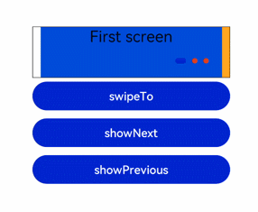
<div class="container">
<swiper class="swiper" id="swiper" index="0" indicator="true" loop="true" digital="false" cachedsize="-1"
scrolleffect="spring">
<div class = "swiperContent1" >
<text class = "text">First screen</text>
</div>
<div class = "swiperContent2">
<text class = "text">Second screen</text>
</div>
<div class = "swiperContent3">
<text class = "text">Third screen</text>
</div>
</swiper>
<input class="button" type="button" value="swipeTo" onclick="swipeTo"></input>
<input class="button" type="button" value="showNext" onclick="showNext"></input>
<input class="button" type="button" value="showPrevious" onclick="showPrevious"></input>
</div>
1
2
3
4
5
6
7
8
9
10
11
12
13
14
15
16
17
18
2
3
4
5
6
7
8
9
10
11
12
13
14
15
16
17
18
/* xxx.css */
.container {
  flex-direction: column;
  width: 100%;
  height: 100%;
  align-items: center;
}
.swiper {
  flex-direction: column;
  align-content: center;
  align-items: center;
  width: 70%;
  height: 130px;
  border: 1px solid #000000;
  indicator-color: #cf2411;
  indicator-size: 14px;
  indicator-bottom: 20px;
  indicator-right: 30px;
  margin-top: 100px;
  next-margin:20px;
  previous-margin:20px;
}
.swiperContent1{
  height: 100%;
  justify-content: center;
  background-color: #007dff;
}
.swiperContent2{
  height: 100%;
  justify-content: center;
  background-color: #ff7500;
}
.swiperContent3{
  height: 100%;
  justify-content: center;
  background-color: #41ba41;
}
.button {
  width: 70%;
  margin: 10px;
}
.text {
  font-size: 40px;
}
1
2
3
4
5
6
7
8
9
10
11
12
13
14
15
16
17
18
19
20
21
22
23
24
25
26
27
28
29
30
31
32
33
34
35
36
37
38
39
40
41
42
43
44
2
3
4
5
6
7
8
9
10
11
12
13
14
15
16
17
18
19
20
21
22
23
24
25
26
27
28
29
30
31
32
33
34
35
36
37
38
39
40
41
42
43
44
// xxx.js
export default {
  swipeTo() {
    this.$element('swiper').swipeTo({index: 2});
  },
  showNext() {
    this.$element('swiper').showNext();
  },
  showPrevious() {
    this.$element('swiper').showPrevious();
  }
}
1
2
3
4
5
6
7
8
9
10
11
12
2
3
4
5
6
7
8
9
10
11
12