# 列表选择弹窗
说明: 从API Version 8开始支持。后续版本如有新增内容,则采用上角标单独标记该内容的起始版本。
列表弹窗。
# 权限
无
# ActionSheet.show
show(value: { title: string | Resource, message: string | Resource, confirm?: {value: string | Resource, action:() => void}, cancel?😦)=>void, sheets: Array<SheetInfo>, autoCancel?:boolean, alignment?: DialogAlignment, offset?: { dx: number | string | Resource; dy: number | string | Resource } })
定义列表弹窗并弹出。
参数:
| 参数名 | 参数类型 | 必填 | 默认值 | 参数描述 |
|---|---|---|---|---|
| title | string | Resource | 是 | - | 弹窗标题。 |
| message | string | Resource | 是 | - | 弹窗内容。 |
| autoCancel | boolean | 否 | true | 点击遮障层时,是否关闭弹窗。 |
| confirm | { value: string | Resource, action: () => void } | 否 | - | 确认按钮的文本内容和点击回调。 value:按钮文本内容。 action: 按钮选中时的回调。 |
| cancel | () => void | 否 | - | 点击遮障层关闭dialog时的回调。 |
| alignment | DialogAlignment | 否 | DialogAlignment.Default | 弹窗在竖直方向上的对齐方式。 |
| offset | { dx: number | string | Resource, dy: number | string | Resource } | 否 | { dx: 0, dy: 0 } | 弹窗相对alignment所在位置的偏移量。 |
| sheets | Array<SheetInfo> | 是 | - | 设置选项内容,每个选择项支持设置图片、文本和选中的回调。 |
# SheetInfo接口说明
| 参数名 | 参数类型 | 必填 | 参数描述 |
|---|---|---|---|
| title | string | Resource | 是 | 选项的文本内容。 |
| icon | string | Resource | 否 | 选项的图标,默认无图标显示。 |
| action | ()=>void | 是 | 选项选中的回调。 |
# 示例
// xxx.ets
@Entry
@Component
struct ActionSheetExapmle {
build() {
Flex({ direction: FlexDirection.Column, alignItems: ItemAlign.Center, justifyContent: FlexAlign.Center }) {
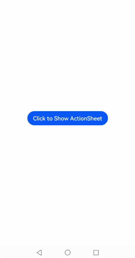
Button('Click to Show ActionSheet')
.onClick(() => {
ActionSheet.show({
title: 'ActionSheet title',
message: 'message',
confirm: {
value: 'Confirm button',
action: () => {
console.log('Get Alert Dialog handled');
}
},
sheets: [
{
title: 'apples',
action: () => {
console.log('apples');
}
},
{
title: 'bananas',
action: () => {
console.log('bananas');
}
},
{
title: 'pears',
action: () => {
console.log('pears');
}
}
]
})
})
}.width('100%')
.height('100%')
}
}
1
2
3
4
5
6
7
8
9
10
11
12
13
14
15
16
17
18
19
20
21
22
23
24
25
26
27
28
29
30
31
32
33
34
35
36
37
38
39
40
41
42
43
2
3
4
5
6
7
8
9
10
11
12
13
14
15
16
17
18
19
20
21
22
23
24
25
26
27
28
29
30
31
32
33
34
35
36
37
38
39
40
41
42
43